How to get a skeleton screen in your React Native app?
The skeleton screen is a crucial part of UX design. If you are thinking that the skeleton screen makes your app content load faster, then you are probably misguided by the concept of skeleton screens. It is just that skeleton screens make app users feel that the content is loading. Also, a layout of the page appears before them on the app screen before the content is actually visible. As a React Native developers, if you want to know how you can use the React Native framework to create the skeleton screen for your app, then you have arrived at the right place.
The main part of the project is installing the third-party plugins and creating the codebase in the app directory. However, before that, we will get some understanding of the concept of the skeleton screen, its utility, and the prerequisite context of the current project.
What is a Skeleton screen?
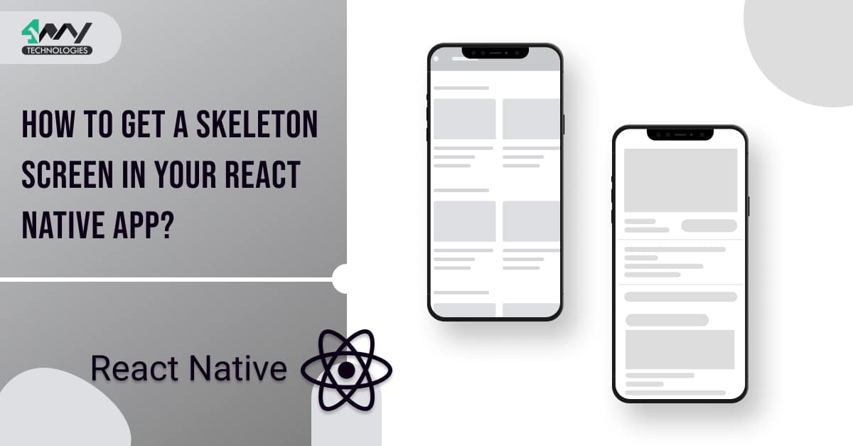
A skeleton screen is a placeholder of the app or webpage content that appears on the screen till the actual content of the app or web page completely loads. It is just the wireframe or layout of a webpage or an app with which users get an indication that the app or webpage is loading.
Why do you need to use a Skeleton screen interface in your app?
Designing a proper structure of a Skeleton screen is a way to increase User experience. Thus, you need to use a Skeleton screen to attain an optimum level of user experience. To be specific, here are the following reasons why you need to design a Skeleton screen.
- For a webpage or app which has heavy content with several text and image elements on it.
- To avoid a boring black loading screen and make the loading screen much more interesting. Note that, don't confuse the splash screen with a skeleton screen. Both these screens are entirely different. Check the linked article to understand what a splash screen is.
- Give clear feedback to users regarding the app loading and the layout (skeletal structure) of its content. Hence, your users will not get frustrated, lost, or confused about the loading timing of the web page or the app.
Variation of Skeleton Screens
There are two types of skeleton screens namely Colour Wireframes and Content Wireframes.
Now, you may be confused with these two variations.
Let me explain with some screenshots from each of these types.
The differences between these two types of Skeleton Screens lie in the colors.
Colour Wireframes- A color wireframe or related Skeleton Screen is specific-color dominant. Despite the grey color placeholders for all types of content, viewers will see a particular color for the placeholder. Websites like Pinterest use color wireframes for their apps and web pages.
Thus, in a color wireframe, the webpage or app users get the layout of its UI along with the specific color. However, it is comparatively complicated to design such a skeleton screen.

Content Wireframe for Pinterest (webpage)
Content Wireframes- A content wireframe or related Skeleton Screen is grey-color dominant. This means that the loading layout that a user sees before the webpage or app completely loads is grey in color.
Some of the common examples that you can refer to for the content wireframe are Facebook, Linkedin, and Github.

Content Wireframe for GitHub

Content Wireframe for LinkedIn

Content Wireframe for Facebook on the webpage
If not Skeleton screen, What else?
Yes, you can use other screens as loading screens in apps or web pages if you are not considering a skeleton screen.
The possibilities are a spinner, a progressive bar, or a custom animated loading screen. However, these are neither useful nor visually appealing as they don't give enough insight to the users about the content layout while the webpage or app pulls data from the web server.
What are the Prerequisite Learnings?
Before starting with the codebase, you have to ensure that you have met the prerequisites criteria. Let's see what those are.
The first one is to set your dev system to that of the React Native environment. Without the necessary software, you can’t get started with the React Native framework. Right? So, check the article to know more about the process of setting up the environment of React Native in your system.
The next one is to learn the steps of building a React Native app from scratch. This criterion cannot be avoided. Getting the skeleton screen will need a basic app with no components. Only, then you will get a place (app) to store the features or rather the codebase of the Skeleton screen. Visit the tutorial blog, if you are a complete beginner in using react Native framework.
.js files to be created in the root directory
For this project, you need to create three different .js files in the app directory. However, before getting the interface, you have to create a basic app using React Native framework. Then only you can create the following files in your code editor and embed the needed interface for your app.
- CardSkeleton.js
- MainSkeleton.js
- App.js
Let’s understand the codebase of each of these .js files.
You can find the entire codebase in the GitHub repository.
CardSkeleton.js
First, you need to create a folder named ‘Skeleton’ in your app directory. For this, you have to open the code editor. Here, I am using the VS Code editor. Create this ‘Skeleton’ folder in your code editor. Now, you have to add two files named CardSkeleton.js and MainSkeleton.js in the ‘Skeleton’ folder.
In these two files, you have to generate a certain codebase. One of these, you will learn from this section, and the other one we will cover in the next section.
Import the components from the React Native packages. It can be the native React Native libraries or can be third-party libraries from React Native. Given below is the required syntax.
1
2
3
import { View, Text, Animated, StyleSheet, Easing } from 'react-native'
import React,{useEffect} from 'react'
import LinearGradient from 'react-native-linear-gradient';
Here, react-native and react are the core or native libraries of React Native framework. However, react-native-linear-gradient is the third-party RN library.
For installing this third-party library, you have to pass npm install react-native-linear-gradient --save. Note that you have to pass the command in your project terminal.
So, we have to import View, Animated, StyleSheet, Easing, Text, React, useEffect and LinearGradient.
const AnimatedLG=Animated.createAnimatedComponent(LinearGradient)
Now add the following
1
2
3
4
5
6
7
8
9
10
11
12
const CardSkeleton = ({height,width}) => {
    const animatedValue=new Animated.Value(0)

    useEffect(()=>{
        Animated.loop(
        Animated.timing(animatedValue,{
            toValue:1,
            duration:1000,
            easing:Easing.linear.inOut,
            useNativeDriver:true
        })).start()
    },[])
Here, the logic behind the code syntax is to show the user that something is loading. It uses the custom component, CardSkeleton to design the skeleton of the card and the loading animation.
Animated is the React Native component that is used to animate elements. As you can notice, I imported this component from react-native at the beginning of the codebase.
With Animated.Value(0), the code creates an animated value that starts at 0. Animated.timing() builds an animation that changes value over time. Timing is a function that will change the value of animatedValue from 0 to 1 in 1000 milliseconds. Animated.loop() repeats the animation.
1
2
3
4
  const translateX=animatedValue.interpolate({
        inputRange:[0,1],
        outputRange:[-width,width]
    })
The above-given code syntax is used to create a linear gradient that moves from left to right. It's used as a skeleton loader for cards.
The key components in the above syntax are Animated.Value and Animated.interpolate().
Here, animatedValue represents the animated value that you want to map. It's a number between 0 and 1. The animated value is a number that changes from 0 to 1 and back to 0. The interpolate function maps the input range of values (0,1) to the output range (-width, width). So when the animated value is 0, it's mapped to -width. When it is 1, it is mapped to width.
Also, AnimatedLG is a component that takes an animated value and maps it to the translateX property of the style. AnimatedLG is a component that has the same API as LinearGradient. It is created by calling createAnimatedComponent() on Animated.
1
2
3
4
5
6
7
8
9
10
11
12
13
14
15
return (
    <View
    style={{backgroundColor:"#a0a0a0",
    height:height,width:width,
    overflow:"hidden",borderRadius:5}}>

     <AnimatedLG
     colors={["#a0a0a0","#b0b0b0","#b0b0b0","#a0a0a0"]}

     start={{x:0,y:0}}
     end={{x:1,y:0}}
     style={{...StyleSheet.absoluteFill,
     transform:[{translateX:translateX}]}}
     />
    </View>
Here, the code creates a loading effect for the user while data is being fetched from an API or database. Four colors with unique code: #a0a0a0,#b0b0b0,#b0b0b0, and #a0a0a0 is used in the animation.
Now, you use two props in the code line namely start={{x:0,y:0}} and end={{x:1,y:0}} to set the start and end points of the gradient. These are passed to the LinearGradient component. As mentioned, the gradient starts at the top left corner of the component and ends at x:1.
… in JavaScript implies the spread operator. With this, you can take an object or array and expand it into its individual items. For instance,
const beebo=[4,5,6]
console.log(...beebo) // 4 5 6
Moreover, absoluteFill is an object that contains all the properties of absolute fill. It means that it will take up all the space available to it.
With transform:[{translateX:translateX}], you are defining this property that allows you to transform the component in 2D or 3D space. In this case, you have used translateX which moves the component along the x-axis by a certain amount of pixels. Here, the component is Animated.
Lastly, you have to export the CardSkeleton component using the line export default CardSkeleton. This way, you can import it into another file and use it further to get the desired result.
Let’s see how you can use the CardSkeleton component in the MainSkeleton.js file.
MainSkeleton.js
As we have created the file named MainSkeleton.js in the Skeleton folder, we will start creating the codebase.
For this, you need to import the React Native components. Following is the codebase.
1
2
3
import React from 'react'
import CardSkeleton from './CardSkeleton'
import {View,ScrollView} from "react-native"
Apart from the core components, you have to import the previously created CardSkeleton component from ./CardSkeleton.
Now, introduce a custom component MainSkeleton using the code line
function MainSkeleton()
and start adding different objects, components, and props.
Add the syntax
1
2
3
return (
    <ScrollView style={{flex:1,backgroundColor:"#26262D",padding:10,}}>
    <View style={{marginVertical:10,}}>
To start with creating the skeleton screen of the main page. Here, styling objects such as flex, backgroundColor, and padding are used for the ScrollView.
1
2
3
 <CardSkeleton height={410} width={370} borderRadius={5} />
    </View>
    <View style={{marginVertical:10,marginLeft:10}}>
The above syntax is creating a Card Skeleton element with a height of 410 pixels, a width of 370 pixels, and a border radius of 5. The View component is then used to add a margin of 10 to the top and bottom of the CardSkeleton, and a margin of 10 to the left.
Similarly, I have created four different card skeleton elements with different height, width, and borderRadius. These four elements will also have different vertical margins and left margins.
Here is the code syntax given below for the four remaining card skeleton elements.
1
2
3
4
5
6
7
8
9
10
11
12
13
14
15
<CardSkeleton height={20} width={90} borderRadius={5} />
    </View>
    <View style={{marginVertical:5,marginLeft:10}}>

    <CardSkeleton height={25} width={223} borderRadius={5}/>
    </View>
    <View style={{marginVertical:5,marginLeft:10}}>

    <CardSkeleton height={20} width={367} borderRadius={5}/>
    </View>
    <View style={{marginVertical:5,marginLeft:10,marginLeft:10}}>

    <CardSkeleton height={32} width={110} borderRadius={25} />
    </View>
    <View style={{flexDirection:"row",marginVertical:20}}>
Note that the card skeleton is a placeholder for a card that will be filled with content later.
1
2
3
4
5
6
7
8
9
10
11
12
<View style={{marginLeft:20}}>
<CardSkeleton height={60} width={60} borderRadius={50} />
</View>
<View style={{marginLeft:30}}>
<CardSkeleton height={60} width={60} borderRadius={50} />
</View>
<View style={{marginLeft:30}}>
<CardSkeleton height={60} width={60} borderRadius={50} />
</View>
<View style={{marginLeft:30}}>
<CardSkeleton height={60} width={60} borderRadius={50} />
</View>
The code is using the View component to create a margin of 20 pixels on the left side of the first CardSkeleton, and a margin of 30 pixels on the left side of the other three CardSkeletons. The CardSkeletons have a height of 60 pixels, a width of 60 pixels, and a border radius of 50 pixels.
Lastly, close the tag with </View> and </Scrollable>. Don't forget to add the line
export default MainSkeleton
To export the component MainSkeleton and use it in the next App.js file.
App.js
This is the last file that you have to create.
First, import all the relevant components.
1
2
3
import { StyleSheet, Text, View } from 'react-native'
import React from 'react'
import MainSkeleton from './Skeleton/MainSkeleton'
Here, the main component is the MainSkeleton component that you have built in the MainSkeleton.js file.
Now, simply add the following line
1
2
3
4
5
6
import { StyleSheet, Text, View } from 'react-native'
import React from 'react'
import MainSkeleton from './Skeleton/MainSkeleton'
    </View>
  )
}
Here, you are framing a React component App. Use the App component to return a View component. Also, add a style prop set to the styles.container object. There is a MainSkeleton component inside the View component. Here, you can refer to the MainSkeleton as the JSX element.
Finally, add the below-given lines and you have successfully created the App.js file. export default App
1
2
3
4
5
const styles = StyleSheet.create({
  container:{
    flex:1
  }
})
Testing the skeleton screen interface on the emulator
Testing the built interface does not require much effort. Open the command prompt from your project folder and run npm install. After this command, you have to pass npx react-native run-android.
Wait, it will take some time to bundle and start the emulator on your dev system. As it is done, you will see an emulator screen as shown in the below image.

So, this is your final built Skeleton Screen.
Final notes
Building a Skeleton screen only needs setting up the correct environment, installing third-party libraries, and learning the basics of React Native app-building steps and you are all geared up to move ahead with creating the codebase for three separate files. Go through the blog if you have not followed the steps as I proceeded.

A science graduate who has a keen interest to lean about new technologies and research area. With an experience in the field of data analytics and content writing, she aims to share her knowledge among passionate tech readers.