How to create a React Native modal view with reference to a project

Struggling to create a modal view for your React Native app? With a reference to a real project, let’s practice together to build an interactive app view with the Modal component.
Find the entire project at GitHub link.
What is the use of React Native Modal?
Modal is one of the native components of the React Native framework. It is categorised under the View component. With this component, you can render your content over an enclosed display. It improves the user experience of your app. You can use this component on both android and iOS devices.
The use case of a React Native component becomes more transparent when you become familiar with the associated props.
With Modal, you can use the following props. Also, note that there are other props that are specific to iOS devices. However, in this current scenario, we will focus only on the props of Modal which are specific to Android devices.
- animationType- It is the kind of prop that can allow you to define the animation style of the modal view. The values can be slide, fade, or none. If you don't specify any animationType value in your codebase, it will consider the none prop as its default style. This means that the modal view will not have any animation. In this current project, we have used the slide as the value of the
animationType. - hardwareAccelerated- This prop directs whether to push hardware acceleration or not for the window underlying within. Also, you have to add a boolean value to this prop. It can be either true or false. The default value is false.
- onShow- This prop is used as a function and is called after the modal is shown.
- statusBarTranslucent- This prop holds boolean values (either true or false). It decides if the created modal should be placed under the statusbar.
- Transparent- You can add either true or false to the transparent prop. The modal is presented on a transparent background if the value of transparent is set to true.
- Visible- It decides the visibility of the modal. The default value is false, which means that the modal is not visible.
What are the prior needed learnings?
For this project, the prior-needed learnings are as follows
- Learn the setup procedures- As we need React Native framework to build the project, we have to set up the environment. Also, you have to use the React Native CLI tool. Check the article attached and go to the React Native CLI section to understand the required setup process. If you are stuck with this step, you may seek help from a React native app development company.
- Learn to build a template using React Native framework- Why do you need a template? You need this to build before going forwards with creating the modal view because you need to hold the codebase somewhere. Right? This template will be the storage box.
So, follow the below-given quick steps to learn building a React Native template.
- Close all the windows already opened on your system and land on the home screen.
- Create a folder named ‘React_Native’.
- Open the command prompt and type cd React_Native. This will allow you to enter the ‘React_Native folder. Note that the folder should be created in the C drive.
- Then run
npx react-native init Modal_View --version 0.68.1. Hence, the template with the name ‘Modal_View’ will be created inside the React_Native folder.
Now you can add the codebase in this template.
Creating the codebase
Open the code editor from the ‘Modal_View’ template (folder located in your C drive) and go to the App.js file.
1
2
3
4
5
6
7
8
9
10
import {
  StyleSheet,
  Text,
  View,
  Modal,
  Image,
  TouchableOpacity,
  Dimensions,
} from 'react-native';
import React, {useState} from 'react';
You have to use the JavaScript import statement and import Text, View, Modal, Dimensions, Image, TouchableOpacity and StyleSheet.
The useState import is to store and update the state in the application.
Also, React import is considered to get all the components of React.
Let me give a brief overview of the considered components.
StyleSheetis for embedding styles for the app.Textis for displaying text.Viewis for creating containers for other components.Modalis for building modal windows.Imageis for rendering images.TouchableOpacityis for creating buttons.Dimensionsare for making the app responsive.
const App = () => {
const [modalVisible, setModalVisible] = useState(false);
The code introduces the main component App. it uses the useState hook to build a state variable modalVisible. The initial value of this state variable is false.
Another variable setModalVisible is used for updating any change in the value of modalVisible.
1
2
3
4
5
6
7
8
9
10
 return (
    <View style={styles.container}>
      <View>
        <Text style={styles.Modal_text}>create Modal</Text>
        <Image
          source={{
            uri: 'https://s-media-cache-ak0.pinimg.com/originals/40/4f/83/404f83e93175630e77bc29b3fe727cbe.jpg',
          }}
          style={styles.image}
        />
Now, it returns the View, Text and Image components. It specifies that the modal view consists of a View, a Text, and an Image. The View has a style of styles.container and the Text has a style of styles.Modal_text. The Image has a source of an image from a URL and a style of styles.image.
A text element ‘create Modal’ is added under the Text component. It will be shown at the top of the screen.
You can change the image of the modal view by replacing the image source in the code.
1
2
3
4
5
6
  <TouchableOpacity
          style={styles.create_btn}
          onPress={() => setModalVisible(true)}>
          <Text style={styles.btn_text}>Open Modal</Text>
        </TouchableOpacity>
      </View>
The code creates a button with the text "Open Modal". onPress prop is used, which on pressing, will set the modal visible to true. The style and text of the button are defined in the styles object.
1
2
3
4
5
6
7
8
 {modalVisible == true ? (
        <View style={styles.FullBack_width}></View>
      ) : null}
      <Modal animationType="slide" transparent={true} visible={modalVisible}>
        <View style={styles.Modal_box}>
          <Text style={{color: '#000000', fontSize: 16, marginTop: 10}}>
            Hello World!
          </Text>
This code creates a modal that will appear when the modalVisible variable is set to true. The modal contains a view with a text element that says ‘Hello World!’.
Here, the code uses a ternary operator to check if modalVisible is true, and if it is, it will render a View element with the style of FullBack_width and the text element ‘Hello world’ colored in black and a font size of 16.
. If modalVisible is not true, it will render nothing.
The modal will also have an animation type of slide and it will be transparent. This means that when the user clicks on the button ‘Open Modal’, it will slide and present the main screen with ‘Hello World’ in it.
1
2
3
4
5
6
7
8
9
10
<TouchableOpacity
            style={styles.modal_btn}
            onPress={() => setModalVisible(false)}>
            <Text style={{color: '#ffffff'}}>Button</Text>
          </TouchableOpacity>
        </View>
      </Modal>
    </View>
  );
};
This code creates a modal view with a button inside it.
The modal is created using the Modal component from React Native. The TouchableOpacity component from React Native creates the buttons inside the modal view. The style of the button is set using the styles.modal_btn variable.
When the user presses the button, the setModalVisible function is called with a parameter of false. It will close the modal.
The text of the button is set to "Button" and the color of the text is set to white.
In place of creating the ‘Button’ inside the modal view, you can embed other functions like page navigations. Since our main intention is to build the modal view, I have created a simple view with the modal component.
Use the line export default App; to export the component App.
Now, it starts the styling part. For this, we have considered the styling objects such as
1
2
3
4
5
6
container, Modal_text, image, create_btn, btn_text, FullBack_width, Modal_box, and  modal_btn.
const styles = StyleSheet.create({
  container: {
    flex: 1,
    backgroundColor: '#000000',
  },
With StyleSheet.create, the code creates a StyleSheet for all the styling objects.
Here, the styling parameters used are flex and backgroundColor.
1
2
3
4
5
6
  Modal_text: {
    fontSize: 20,
    color: '#ffffff',
    alignSelf: 'center',
    marginTop: 20,
  },
For the Modal_text, you can use fontSize, color, alignSelf and marginTop.
1
2
3
4
5
 image: {
    width: '100%',
    height: 500,
    marginTop: 20,
  },
Here, for the image, we have used a specific width, height, and marginTop. Note that, we have set the width value in percentage. This is to attain responsiveness.
1
2
3
4
5
6
7
8
9
10
  create_btn: {
    width: 340,
    height: 50,
    backgroundColor: '#CD5808',
    borderRadius: 20,
    alignItems: 'center',
    justifyContent: 'center',
    marginHorizontal: 30,
    marginTop: 20,
  },
For the create_btn, width, height, backgroundColor, borderRadius, alignItems, justifyContent, marginTop and marginHorizontal are considered.
You can set the value as per your preference.
1
2
3
4
btn_text: {
    color: '#ffffff',
    fontSize: 20,
  },
For the btn_text, fontSize and specific color are used.
1
2
3
4
5
6
7
8
 FullBack_width: {
    width: '100%',
    height: '100%',
    position: 'absolute',
    elevation: 1,
    backgroundColor: 'rgba(0, 0, 0, 0.65)',
    flex: 1,
  },
Here, the styling parameters width, height, position, elevation, flex, and backgroundColor are used.
1
2
3
4
5
6
7
8
9
10
11
12
  Modal_box: {
    width: Dimensions.get('screen').width - 65,
    height: 122,
    backgroundColor: '#FFFFFF',
    marginVertical: 280,
    borderRadius: 15,
    alignSelf: 'center',
    alignItems: 'center',
    shadowOpacity: 0.25,
    shadowRadius: 3.5,
    elevation: 10,
  },
For the Modal_box, the parameters that you can use are width, height, backgroundColor, marginVertical, borderRadius, alignSelf, alignItems, shadowOpacity, shadowRadius, and elevation.
Note that we have used the Dimensions method in setting the width value for Modal_box. This way, you can make your app responsive to different devices.
If you want to learn more about ‘How to make your app responsive’, you can check the article linked.
1
2
3
4
5
6
7
8
9
10
11
 modal_btn: {
    width: 90,
    height: 30,
    justifyContent: 'center',
    alignItems: 'center',
    backgroundColor: '#CD5808',
    borderRadius: 8,
    marginTop: 20,
    marginHorizontal: 10,
  },
});
Lastly, for modal_btn, you can consider width, height, justifyContent, backgroundColor, alignItems, borderRadius, marginTop and marginHorizontal.
Running the codebase for the output
Here, what you basically need to do is to run the codebase and get the output of the modal view on the emulator. Let's see how you can achieve this.
- Open the command prompt from your dev system and run cd Modal_View in it.
- It will take you inside the project Modal_View.
- Run npm install. It will install the dependencies.
- Then run npx react-native run-android.
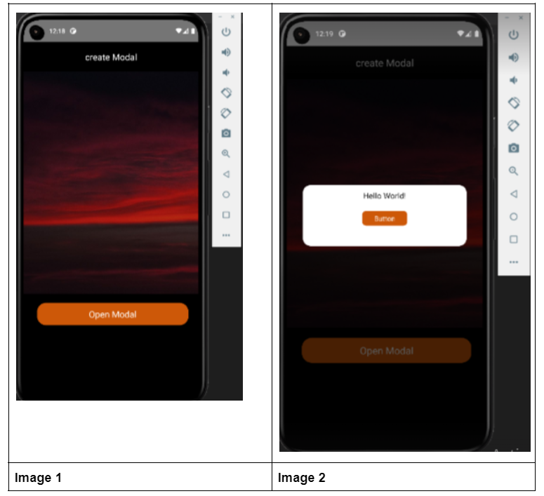
This is all you need to do. Your emulator will start. Refer to image 1 and image 2 for the modal view on the emulator.
Final Notes
Building a Modal view is another way to make your app more presentable. With its props, you can personalise the view. All you need to learn about its utility and application. Also, if you have not worked with React Native framework before, you have to set up the environment. Missing out this step, you cannot build and execute the program. So with this article, get the guided step and start developing the program.

A science graduate who has a keen interest to lean about new technologies and research area. With an experience in the field of data analytics and content writing, she aims to share her knowledge among passionate tech readers.