How to make react native apps responsive?

While you are building an app, it is important to make its design and layout responsive. Are you struggling to achieve this goal with react native apps? Then you are at the right place. This article will guide you throughout to make React Native apps responsive.
What is a responsive app?
The responsive app is an app either mobile or web that responds constructively based on the screen size, platform, and orientation. To make an app responsive, you have to create flexible layouts, images and grids. Precisely you have to create responsive UIs for your app. A lower degree of responsiveness reduces the utility of apps.
If you are still confused about the need for a responsive app, let’s take an example. Consider you are building an app that is not responsive. In that case, you won't be able to run your apps on different devices with varied screen sizes. Here, you need to design your code in such a manner that will allow your app or rather the app’s UI to be consistent across different screens. It is one of the foremost things that react native expert or hire react native developers should consider while building a react native app.
Let’s see in detail how you can execute such operations. Here, I have included practical codes and their output to show how responsiveness works with different approaches.
Prerequisites
Before making a react native app responsive, you should build a react native app. If you are struggling with building a react native app, we have got you covered with detailed steps for building a react native app from scratch. Check the article to get all-inclusive insight.
Using React Native Dimensions
Dimensions are one of the components of React Native. It is used to get the width and height of the screen on which you are running the app. In simpler terms, it is used to make your app responsive on different-sized screens.
Here what I have done is import Dimensions from React Native. Also used const {height, width} = Dimensions.get('window') to get the reference height and width of the device screen in which you are running the app.
1
2
3
4
5
6
7
8
9
10
11
12
13
14
15
16
17
18
19
20
21
22
23
24
25
26
27
28
29
30
31
32
33
34
35
36
37
38
39
40
41
import React, {Component} from 'react';
import {View, Text, Dimensions, TouchableOpacity} from 'react-native';
const {height, width} = Dimensions.get('window');

class App extends Component {
  render() {
    return (
      <View
        style={{
          flex: 1,
          alignItems: 'center',
          justifyContent: 'center',
          backgroundColor: 'blue',
        }}>

        <View
          style={{
            width: width - 60,
            height: height / 3,
            backgroundColor: 'yellow',
            justifyContent: 'center',
            alignItems: 'center',
          }}>
          <TouchableOpacity
            style={{
              backgroundColor: '#a9a9a9',
              alignItems: 'center',
              width: '60%',
              height: 40,
              justifyContent: 'center',
              borderRadius: 25,
            }}>
            <Text>Life is a mess!!</Text>
          </TouchableOpacity>
        </View>
      </View>
    );
  }
}

export default App;
Here, I have used https://snack.expo.dev/ to run my code. Refer to the following three images which show the react native app is responsive on three screens namely web, android device, and iOS device.
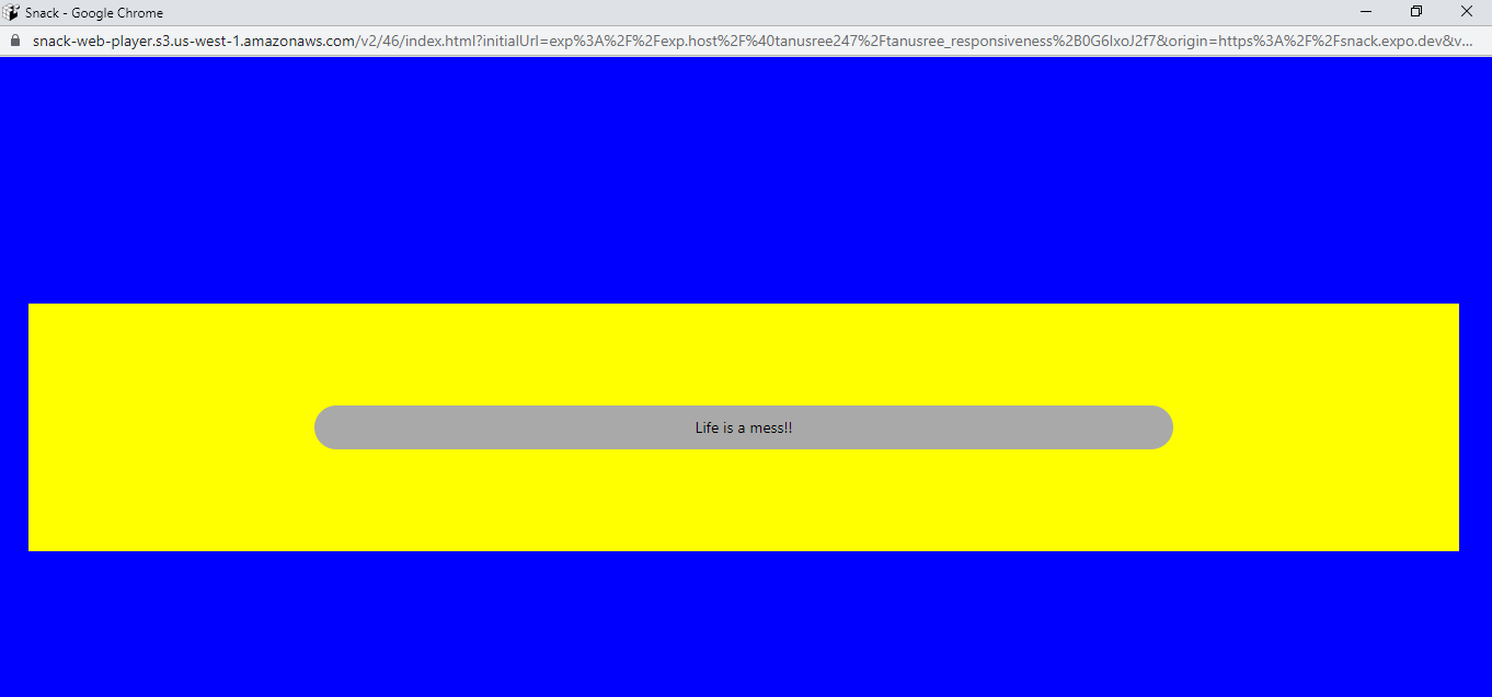
Output for web

Output for iOS phone

Output for android device
Go for Flexbox
Flexbox is a kind of layout that you can optimise to build different user interfaces. It is designed to render a compatible design to an app so that you can run it on different screens.
You don't have to use different elements to make your layout responsive. The 2 attributes of flexbox flexDirection and flex would suffice. You may use justifyContent and alignItems to get the proper layout. Although we have used justifyContent in our codebase, we did not need the requirement of using alignItems in our codebase.
Let me make the significance of different React Native flexbox components clear before starting with the code base.
Flex: Flex is used to define how the elements used in the app will occupy the space along the container’s main axis. The distribution of the space among each element is based on their flex property.
For example, in this given codebase, I have used five different text elements namely cat, dog1, parrot, fox, and elephant. Here, you can see that I have allocated flex: 6 for content1, flex: 5 for content2, flex: 4 for content3, flex: 3 for content4, flex: 2 for content5 and flex: 1 for content6. It means that content1 will take 6/21 of the space. Similarly, content6 will take 1/21 of the space, and so on. If you are confused about why I am mentioning 21, it is the sum (1+2+3+4+5+6=21) of all flex measures I have used for the six elements. Larger the measure of the flex, the higher the ratio of the available space an element will occupy in comparison to its siblings.
flexDirection: FlexDirection can be defined as either ‘row’, ‘column’, ‘column-reverse’, or ‘row-reverse’. In React Native Flexdirection is used to define whether considered items or elements will be displayed horizontally or vertically.
Here, in this codebase, I have defined flexDirection as a ‘column’.
justifyContent: justifyContent can be specified as ‘space-between’, ‘space-around’, ‘flex-end’, ‘center’, ‘flex-start’, and ‘space-evenly’. It is used to define the alignment of children or elements within the container.
Refer to the following codebase for making your React Native app responsive with flexbox.
1
2
3
4
5
6
7
8
9
10
11
12
13
14
15
16
17
18
19
20
21
22
23
24
25
26
27
28
29
30
31
32
33
34
35
36
37
38
39
40
41
42
43
44
45
46
47
48
49
50
51
52
53
54
import React from 'react'
import { StyleSheet, Text, View } from 'react-native';

const Flex1 = () => {
    return (
        <View style={styles.container}>

            <Text style={styles.content1}>cat</Text>
            <Text style={styles.content2}>dog1</Text>
            <Text style={styles.content3}>parrot</Text>
            <Text style={styles.content4}>fox</Text>
            <Text style={styles.content5}>elephant</Text>
        </View>
    )
}

const styles = StyleSheet.create({
    container: {
        flex: 6,
        flexDirection: 'column',
        backgroundColor: 'black',
        justifyContent: 'space-around',
        textAlign: 'center',
    },

    content1: {
        flex: 5,
             backgroundColor: 'yellow',
              textAlign: 'center',

    },
    content2: {
        flex: 4,
              backgroundColor: 'grey',
 textAlign: 'center',
     },
    content3: {
        flex: 3,
             backgroundColor: 'crimson',
              textAlign: 'center',

    },
    content4: {
        flex: 2,
           backgroundColor: 'white',
 textAlign: 'center',
    },
    content5: {
        flex: 1,
              backgroundColor: 'green',
 textAlign: 'center',
    },
});
export default Flex1
Here is the output of responsiveness for three devices using flexbox. For the web platform, I have used Expo snack to run the codebase.
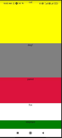
Output for Android device

Output for iOS phone

Output for web
Rely on percentage dimension
With the term ‘whole values’, I mean ‘hard values'. For instance, if you are defining the width and height of the container in whole numbers, then get over these practices. This approach may be suitable for definite screen sizes but not for all. On this note, I would suggest you use ‘percentage dimensions’. This method will help you fill some areas of the screen. Using flexbox may not help you to achieve this. Thus using Percentage Dimensions is the most appropriate.
However, in percentage dimensions, you have to define the parent component with a specific value or size. This will allow you to expand the children component.
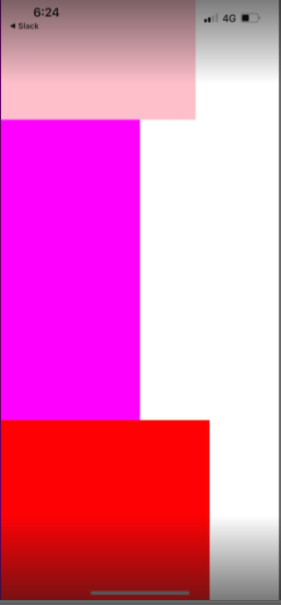
Refer to the following codebase for making your React Native app responsive using percentage dimensions. Here, I have defined the heightas 100% under <View style> to expand the height of three elements (colors).
1
2
3
4
5
6
7
8
9
10
11
12
13
14
15
16
17
18
19
20
import React from 'react';
import { View } from 'react-native';

const PercentageDimensionsBasics = () => {
  return (
    <View style={{ height: '100%' }}>
      <View style={{
        width: '70%', height: '20%', backgroundColor: 'pink'
      }} />
      <View style={{
        width: '50%', height: '50%', backgroundColor: 'magenta'
      }} />
      <View style={{
        width: '75%', height: '40%', backgroundColor: 'red'
      }} />
    </View>
  );
};

export default PercentageDimensionsBasics;
Refer to the following three images for the output on three screens namely web, iOS device, and Android device.
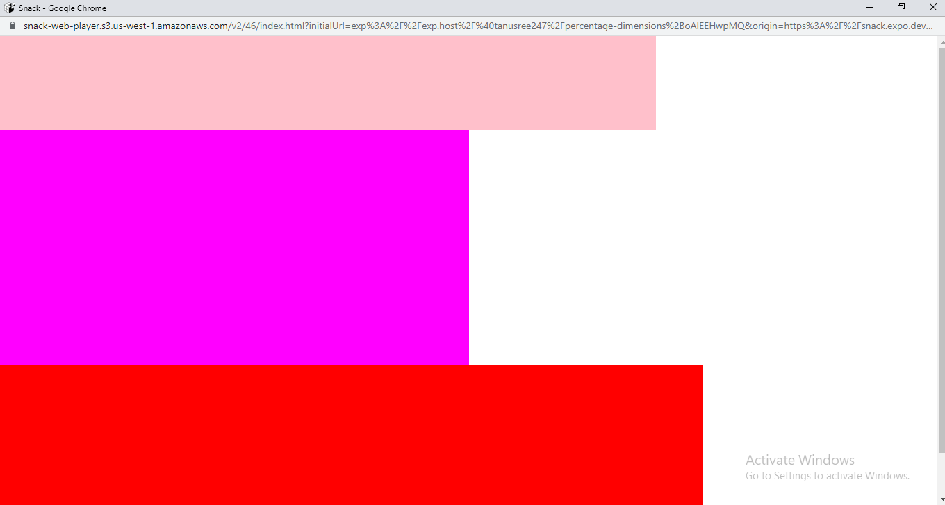
Output for web
Output for iOS phone

Output for android phone
Final words
Making a react native app responsive is one of the most crucial tasks of a react native expert. If you are one of the experts who are struggling to incorporate responsiveness within your app, you should consider these three approaches. These include using react native dimension, percentage dimensions, and flexbox. You cannot use all three approaches at a time but have to choose one of these three based on your project preference. I have made your choice easier by providing a practical codebase and respective outputs for each method. Practise all these methods to get a clear idea of how React Native apps get responsive to different screens.

A science graduate who has a keen interest to lean about new technologies and research area. With an experience in the field of data analytics and content writing, she aims to share her knowledge among passionate tech readers.