How to add a date picker feature in react-native?

A date picker is a UI-based feature that allows users to input dates or times. This is used in apps that need to allow users to select dates or times. Users can also schedule their meetings or important events using this date picker feature available in their app. In this blog, we will show you how to add the feature of Date picker (or CalendarPicker) to your React Native app.
As usual, we have to cover the prior-needed tasks. These are as follows.
Configuring the React Native Environment
React Native is a cross-platform app development framework, which means that you can use the same codebase for both Android and iOS. However, during the setup process, you have to choose a specific Development OS and a target OS in which you want to develop your project. This is because the SDKs differ for different Development OS.
Under the Development OS, the categories are macOS, Linux and Windows. For the Target OS, the choices are iOS and Android.
Here, we will be focusing on Windows as the Development OS and Android as the Target OS.
After this, you have to choose whether you want to use Expo Go or React Native CLI for adding this feature. Both are the tools used to develop React Native apps. You can learn more about these tools and the underlying difference between these two tools from the linked article.
As per convenience and project requirements, we will choose the React Native CLI for our development.
So, for the current project, we have to install a JDK, Node, Android Studio, and React Native CLI (Command Line Interface). Also, you have to install an IDE. The most common IDE for React Native app developer is Visual Studio Code Editor.
For a detailed process, check the attached blog article.
Framing a basic template folder
You cannot frame the codebase until you create a template for it. It is basically a folder in your local drive (or you can refer to it as a basic app with the simple App.js folder). Follow the given steps to create one.
- Build a new folder in your C drive or you can consider an already built folder in your C drive. I prefer to store all my React Native Projects on the C drive. You can store it on any other drive.
- Run the command prompt from this folder. It will build your template folder in this main folder.
- Run npx react-native init Calendar --version 0.68.1 on the command prompt terminal. Hit enter and it will be done.]
- Your template folder will be named Calendar.
Installing third-party library: react-native-calendar-picker
There are numerous third-party libraries for adding a single feature. We cannot install all those libraries for a single feature. So, I have chosen the most appropriate third-party library named react-native-calendar-picker, keeping the development process less intimidating.
To install this library, run npm install --save react-native-calendar-picker on your project terminal.
If you are wondering about the usefulness of this library in your project. It is that you can import the CalendarPicker component from this library and easily build the date picker feature. Also, the core React Native library does not have this CalendarPicker component in it.
Codebase Program for the Project
The complete codebase is available in the GitHub repository.
To add this codebase, you need to open your template from the code editor. Open the App.js file and start adding the following syntax one after the other.
1
2
3
import { StyleSheet, Text, View } from 'react-native'
import React,{useState} from 'react'
import CalendarPicker from 'react-native-calendar-picker'
Start from the import statement. The code imports Stylesheet, Text, View, useState and React. Text, View, and Stylesheet are from the react-native library whereas React and useState are from the react library.
The useState component is a hook that allows a functional component to use the state in React.
The code also imports a component CalendarPicker from the 'react-native-calendar-picker' library. This component is used to create a calendar-like interface in your app, allowing users to select dates from a calendar.
1
2
3
const App = () => {
  const [selectedStartDate,setSelectedStartDate]=useState(null)
  const [selectedEndDate,setSelectedEndDate]=useState(null)
App is a React component. The code uses the React hook useState to create two state variables, selectedStartDate and selectedEndDate.
The useState hook takes two arguments, the initial value of the state variable and a function to update the state variable.
In this case, the initial state of both state variables is set to null.
The setSelectedStartDate and setSelectedEndDate functions can be used to update the value of selectedStartDate and selectedEndDate state variables, respectively.
1
2
const minDate = new Date();
    const maxDate = new Date(2035,12,3);
The above code syntax creates two Date objects. The first Date object is assigned to the variable minDate and is set to the current date.
The second Date object is assigned to the variable maxDate and is set to December 3, 2035.
1
2
3
4
5
6
7
8
9
const onDateChange=(date,type)=>{
if(type==='END_DATE'){
    setSelectedEndDate(date)
}
else{
  setSelectedStartDate(date)
   setSelectedEndDate(null)
}
}
onDateChange is used as a function that is triggered when the date is changed. It takes two parameters, the date, and the type.
If the type is equal to 'END_DATE', then the selected end date is set to the date. Otherwise, the selected start date is set to the date and the selected end date is set to null.
1
2
3
4
5
6
7
8
9
10
11
12
return (
      <View style={styles.container}>
        <CalendarPicker
          startFromMonday={true}
          allowRangeSelection={true}
          minDate={minDate}
          maxDate={maxDate}
          todayBackgroundColor="#f2e6ff"
          selectedDayColor="#7300e6"
          selectedDayTextColor="#FFFFFF"
          onDateChange={onDateChange}
        />
This code renders a calendar picker.
The calendar picker will start from Monday, allows for range selection, and has a minimum and maximum date set.
The background color of the current day is set to "#f2e6ff", the color of the selected day is set to "#7300e6" and the text color of the selected day is white.
The onDateChange function will be called when the date is changed.
1
2
3
4
5
6
7
<View>
          <Text>SELECTED START DATE:{selectedStartDate?selectedStartDate.toString():'' }</Text>
          <Text>SELECTED END DATE:{selectedEndDate?selectedEndDate.toString():'' }</Text>
        </View>
      </View>
  )
}
This syntax displays the selected start date and end date of a user.
The code uses the ternary operator (:) to check if the selectedStartDate and selectedEndDate variables have a value.
If they do, the code will convert the value to a string and display it.
If the variables do not have a value, an empty string will be displayed.
The text component is used to hold the text elements. Also, these two two text elements are embedded under the View component.
1
2
export default App
const styles = StyleSheet.create({})
Lastly, you have to export the App component and proceed forward with the CSS stylesheet method.
As we have completed building the codebase, let's now check whether we have successfully built it or not.
Program Execution on the emulator
If your program runs as shown in image 1, you have successfully completed the task.
Follow the given steps to run the program on a virtual device.
- Create a new terminal from your project or template folder. You can do this in your code editor.
- Run npm install. This will install the required npm packages.
- Then run npx react-native run-android. Wait for some time till the bundling process starts. You can reload the process if it does not start bundling.
- Once the bundling is 100% done, your app will start.
Image 1 shows the output.
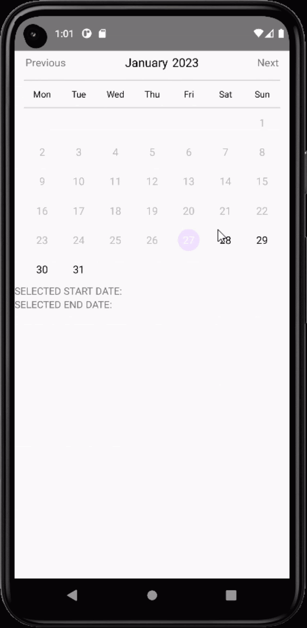
Image 1
Final Notes
An app development task and adding different features to it may seem complicated. However, it is not impossible. Most importantly, you have to choose the right framework. Here React Native plays the role. The JavaScript-based framework can make the entire process easier. So, start adding the date picker feature using the third-party library react-native-calendar-pickerof React Native. You can also customize its interface through experimentation.

A science graduate who has a keen interest to lean about new technologies and research area. With an experience in the field of data analytics and content writing, she aims to share her knowledge among passionate tech readers.