Implementing Deep Linking in React Native Applications
Isn’t it interesting that a link specially customized for your app takes your target audience to your brand’s product page, and that too with a single tap on the defined link? It may have directed your customers to your competitors' pages. But that is not the scene. Have you ever wondered the ‘WHY’ behind this cycle? It’s due to the safeguard or assurance offered by deep linking. Besides smooth navigation, deep linking guarantees the authenticity of your digital presence.
This add-on to your app becomes much easier when you get the most user-friendly framework, React Native. But what if you need more confidence about integrating it yourself? Well, there is a choice! You can always seek expert guidance from a professional React Native development company to make sure your traffic stays exclusively yours. And if you're curious about learning how to do it yourself, this article is here to guide you through integrating React Native deep linking.
You can also check out a previous article on (), in case you are completely amateur in the concept: ‘Deep Linking’.
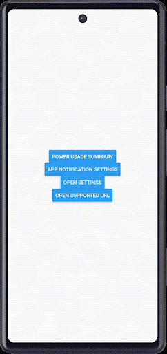
To get you motivated, here is a sneak peek into the final project that you will build by the end of this tutorial guide.
So, let's take the first step toward the project and learn the prerequisites.
Setting Up the React Native Environment
This is the initial step for all those who have not tried their hands on a React Native project. If you are someone who has already built projects on react native, you must have software like Android Studio, VS Code editor, npm, and node.js installed on your dev system.
And you can check the complete guide on the Environment Setup from the article ‘How to set up the React Native Development Environment’. Make sure that you install the React Native CLI for this project.
Making Space For Project Folder
Build a system folder for your defined project. But the main concern is: what’s the step?
- Create a new folder like you usually do.
- Navigate to the terminal from the related folder.
- Run a command npx react-native init DeepLinking --version 0.72.4.
Here is the three-step react native folder-creating process. Now, you can add the codebase and files.
There is no third-party library used for the current project. So, let’s get directly into the codebase. Find the entire source code in the repository.
Import Statements
This is just the starting point to build upon.
import React, {useCallback} from 'react';
import {Alert, Button, Linking, StyleSheet, View} from 'react-native';
The code imports the main ‘React’ library and a hook ‘useCallback’.
useCallback in React Native returns a memoized version of the callback function. This prevents the function from being recreated every time a component re-renders. Thus, it helps avoid unnecessary re-renders and optimize the build's performance.
Other components imported from the ‘react-native’ library include ‘Alert’, ‘Button’, ‘View’, ‘StyleSheet’, and ‘Linking’.
Among these, the ‘Linking’ is the most essential component imported to open deep links. It provides a way to interact with both incoming and outgoing app links.
Custom Button Components For Sending Intent
This code snippet creates the custom button component that, when pressed, sends an intent based on the provided action and extras. It shows an error message (e.message) as an alert if it faces any issues.
1
2
3
4
5
6
7
8
9
10
11
12
13
14
15
16
17
18
19
20
21
22
const SendIntentButton = ({action, extras, children}) => {

const handlePress = useCallback(async () => {

try {

await Linking.sendIntent(action, extras);

} catch (e) {

Alert.alert(e.message);

}

}, [action, extras]);


return <Button title={children} onPress={handlePress} />;

};
The SendIntentButton has three props, namely extras, children, and action. As mentioned, the children are used as the title for the Button, whereas action and extras are associated with the intent.
Linking.sendIntent(action, extras) is to send the intent, and the useCallback hook is integrated to control the button presses.
If you are not aware of the term ‘intents’, It is a mechanism in the Android platform used to communicate between components or even applications.
Custom Button Component for Settings
In this section, create another component, OpenSettingsButton, to open the app's custom settings. It displays a pressable button.
1
2
3
4
5
6
7
8
9
10
11
12
const OpenSettingsButton = ({children}) => {

const handlePress = useCallback(async () => {

// Open the custom settings if the app has one

await Linking.openSettings();

}, []);
return <Button title={children} onPress={handlePress} />;

};
The component OpenSettingsButton accepts a prop (children). It is used as the button’s label.
And the handlePress is considered an asynchronous function wrapped in the useCallback hook. To ensure the function is memoized, the dependency array for useCallback is kept empty ([]). It further ensures performance optimization for the app.
How this custom button allows users to direct to the app’s settings is by using Linking.openSettings() method. It’s a shortcut to jump directly to the app's settings, such as granting permissions or adjusting preferences.
Supported URL Constant
const supportedURL = 'https://www.4waytechnologies.com/';
This snippet declares a constant variable named supportedURL and assigns it the string value 'https://www.4waytechnologies.com/'.
This line of code specifies the URL linked to the button ‘Open Supported URL’ (refer to the project output gif). Users will be directed to the defined URL when they press the button.
Custom Button Component for Opening URLs
OpenUrlLink is another custom button component that lets users easily navigate to the supported URL (linked URL).
1
2
3
4
5
6
7
8
9
10
11
12
13
14
15
16
17
18
19
20
21
22
23
24
25
26
27
28
29
30
31
32
const OpenUrlLink = ({url, children}) => {

const handlePress = useCallback(async () => {


// Checking if the link is supported for links with a custom URL scheme.

const supported = await Linking.openURL(url);


if (supported) {

await Linking.openURL(url);

} else {

Alert.alert(`Don't know how to open this URL: ${url}`);

}

}, [url]);


return <Button title={children} onPress={handlePress} />;

};
The defined component has two props (children and url). When you use this component, you provide a url as a prop. The resulting button, when pressed, tries to open that URL.
The code uses the Linking.openURL(url) method to open the linked (supported) URL when the defined button is pressed. A conditional statement if/else statement is used to decide whether the URL will open on clicking. If the URL is not supported or cannot be opened, the user gets an alert message (`Don't know how to open this URL: ${url}`) on their app screen.
Coding for the Main App Component
The main App component sets up a user interface with several buttons. Each button is a custom-made component (SendIntentButton, OpenSettingsButton, OpenUrlLink) with specific props that determine its behavior and label.
1
2
3
4
5
6
7
8
9
10
11
12
13
14
15
16
17
18
19
20
21
22
23
24
25
26
27
28
29
30
31
32
33
34
35
36
37
38
39
40
41
42
43
44
const App = () => {

return (

<View style={styles.container}>

<SendIntentButton action="android.intent.action.POWER_USAGE_SUMMARY">

Power Usage Summary

</SendIntentButton>

<SendIntentButton

action="android.settings.APP_NOTIFICATION_SETTINGS"

extras={[

{

key: 'android.provider.extra.APP_PACKAGE',

value: 'com.facebook.katana',

},

]}>

App Notification Settings

</SendIntentButton>

<OpenSettingsButton>Open Settings</OpenSettingsButton>

<OpenUrlLink url={supportedURL}>Open Supported URL</OpenUrlLink>


</View>

);

};
The main component defined in this section is the ‘App’. The SendIntentButton component has a prop action with a value of “android.intent.action.POWER_USAGE_SUMMARY”. The custom button created to send intent has its label as ‘Power Usgae Summary’. This title or label text on the button is placed between the opening and closing tags of <SendIntentButton> </SendIntentButton>.
The App component has another SendIntentButton component with two props (action and extras). Here, the action refers to “android.settings.APP_NOTIFICATION_SETTINGS”, and the prop extras are used as an array with an object inside it. The label or title for this button is ‘App Notification Settings’.
The other prop extras are considered an array with an object embedded inside it. This array offers additional information related to the notification settings.
The button component OpenSettingsButton has its button title as ‘Open Settings’. Lastly, the custom-made button component OpenUrlLink has its button label as ‘Open Supported URL’. It has a prop url with a value of ‘supportedURL’.
The Styling Segment
This code defines some styling for the container of the App component. For example, it centers the content both vertically and horizontally on the screen, making it appear in the middle.
1
2
3
4
5
6
7
8
9
10
11
12
13
14
15
16
17
18
const styles = StyleSheet.create({

container: {

flex: 1,

justifyContent: 'center',

alignItems: 'center',

},

});


export default App;
Considering that you have followed the steps and completed the coding part, let’s talk about the best practices considered in this coding section.
Best Practices Considered for the Perfect Deep Linking Integration
The coding practices used in the current project are given as follows.
- Use of React Hooks
Use the useCallback hook to memoize callback functions. This way, you can ensure that the function reference (here, handlePress) remains consistent across re-renders, preventing unnecessary re-renders.
- Descriptive naming for clarity and better readability
Use a clear and descriptive naming convention for the components and variables (here, it is SendIntentButton, OpenSettingsButton, supportedURL). This makes the code more readable and maintainable.
- Separation of Concerns for reusability
In this project, each button is assigned its specific custom-made component (SendIntentButton, OpenSettingsButton, OpenUrlLink). Hence, with this coding approach, you make it modular and easier to maintain.
- Checking URL Support
Before opening a URL using Linking.openURL(), the code checks if the URL is supported using the same function. This is how you ensure that unsupported URLs are restricted, with users notified by an Alert message. It’s an excellent way to enrich the user experience.
Closing Actions: Launch the Program
You cannot miss out on this step, i.e., to test and check the functionality of what you have built so far. So, execute the program on the emulator with the following guided steps.
- Navigate to the command prompt from the app folder.
- Pass two commands:
npm installandnpx react-native run-androidsequentially.
Wait till the program runs on the emulator and you notice the app interface (as mentioned at the start of the article). This is all about the project. You don’t need years of experience to get started with the React Native framework.

A science graduate who has a keen interest to lean about new technologies and research area. With an experience in the field of data analytics and content writing, she aims to share her knowledge among passionate tech readers.