How to create a custom bottom tab navigator in react native

Are you looking for a detailed codebase on how to create a custom bottom tab navigator for your react native app? You are in the correct place. This tutorial blog will provide you with a hands-on experience and room for you to interact with the code base in the attached GitHub repository.
You may be wondering, why I have chosen react native app for this tutorial when I have other app-building frameworks to choose from. Let’s be familiar with an interesting fact about React native. As per the 2021 survey conducted by Stackoverflow, 16.48% of professional developers who have participated expressed their preference for React Native framework. This implies that being a react native development services can mark your presence in the app-building segment.
As far as the bottom tab navigator is concerned, it is a part of the app that allows app users to toggle switch between different icons. It will be useless to create an app if you don’t allow the users to navigate the app. Right? So, let’s get started.
Please check the GitHub repository for the entire codebase used in this tutorial blog.
Prerequisites to consider
Before starting with this tutorial, make sure that you have already created a react native (expo) app. If you are stuck with the app-building process, please check the blog and scroll down to the expo section for a detailed guided step.
Key term required for the tutorial
Pressable: It is a button or can be said a layer that responds to different press interactions on any of the component’s defined children. Importing pressable in the codebase of a project, you can turn a defined segment into a pressable button. It is more customizable, unlike a conventional button.
Step 1: Installing package.json or npm in your project root directory
- Search for “https://www.npmjs.com/package/react-native-ico-material-design/v/2.3.1” on your browser and install the icon material package using the command npm
install --save react-native-ico-material-design react-native-svg. - Note that the
npmcommand will be compatible with the Android OS. You can also tryyarnor other commands based on the OS of your device. - For installing the package, please ensure that you have opened the cmd from your project folder. However, for Mac, you have to type sudo to run it as administrator.
- Run the command on your project or app terminal and insert your password as it asks. Wait for minutes and it will be installed in your system.
Step 2: Import Pressable and image component
- In the third line of the code, put a comma and import
Pressablecomponent after theViewcomponent. - Also you have to import
Imagecomponent afterPressable. This will allow you to import icon images in the bottom tab of the app. Refer to image 1
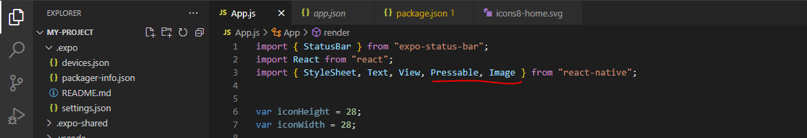
Image 1
Step 3: Run your react native expo app
- Open the command prompt from the app folder and pass
expo startto generate the QR code. - You have to scan the QR code and the app will start running on your android device.
- This step is necessary to simultaneously track the code changes in your root directory.
Step 4: Create global variables
- Here, I will create two global variables outside my expo-built app.
- The first one is the
iconHeight. For this, addvar iconHeight= 28; in the 6th line. You can set theiconHeightas per your preference. I have set it as 26. - Another one is the
iconWidth. For this, addvar iconWidth= 28;in the 7th line of code. You can set it as per your preference. I have set theiconWidthas 28.
Step 5: Import Class Component to export default
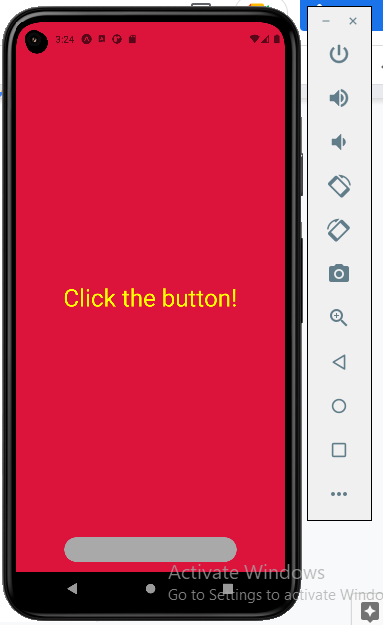
- As I need to use the
stateto change the center display text 'Welcome to 4 Way technologies’ to 'Click the button!', I will use the Class component. - Just add
export default class App extends React.Component{}to extend theReact.Componenet. Consider image 2.
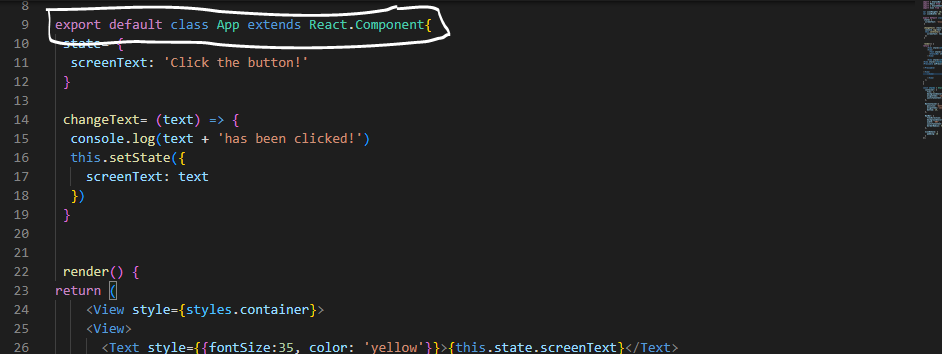
Image 2
- Create a
renderand insert thereturnblock as shown in image 3.
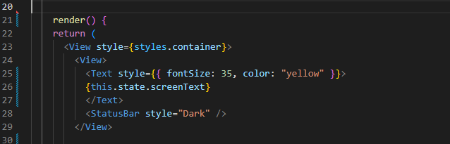
Image 3
Save the entire process to ensure that the app is still running.
Step 6: Proceeding with the remaining step
Add
state= {
screenText: 'Click the button!'
}. Refer to the selected segment in image 4.
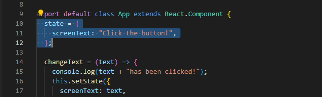
Image 4
- Here, whatever you add in the
screenTextwill be displayed on your app screen. In my case, I have added 'Click the button!' as thescreenText. - Add
changeText. It will take certain texts as a parameter. - Add
console.logto log what text has been pressed. It will tell us if the button we are pressing is the actual button we have chosen to press on. - Pass
text + 'has been clicked!'underconsole.log. - For setting the state, pass
this.setState({
screenText: text,
})
};
Here, I have used the text as the value inside the return block.
- Create another view with a <View> and it will contain the first elements of the page I want to show while I click on a button.
- I will put the below-stated code lines under the </View>
<Text style={{fontSize:35, color:
'yellow'}}>{this.state.screenText}</Text>
<StatusBar style="Dark" />
Here, you can see that I have set the StatusBar style to “Dark”. Set the Text to this.state.screenText to make sure that when I return the program, the screen will display 'Clickthe button!’ as I have defined it on screenText.
- For changing the color and size of the display text, you have to create an inline style with curly brackets.
- With the below-stated command, I have set the font size of the display text as 35 and set the text color as yellow. You are free to choose any color and size.
<Text style={{fontSize:35, color:
'yellow'}}>{this.state.screenText}</Text>
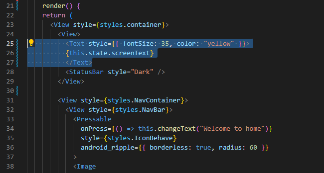
Image 5Alteration in StyleSheet
- With this following code line, I have changed the background colour and set the alignment of the item. You can refer to image 6 for a better understanding.
1
2
3
4
5
6
7
const styles = StyleSheet.create({
  container: {
    flex: 1,
    backgroundColor: '#dc143c',
    alignItems: 'center',
    justifyContent: 'center',
  },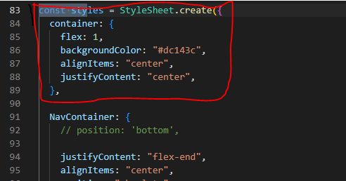
Image 6
Note that you can select the color code from https://reactnative.dev/docs/colors and simply add the code of the color you prefer. With ‘#dc143c', I have painted the background of the app screen crimson.
Step 7: Creating <View></View> for navigation bar
- Now you have to create a Navigation container and Navigation Bar which will contain the different icons at the bottom.
- Without complicating things, let's get into how you can create it. For this, pass the below-stated code line
<View style={styles.NavContainer}>
<View style={styles.NavBar}>
- Here, what I did is created a <View> component to hold the Navigation Container. I have added the
styles.NavContaineras its style. Also added another <View> to hold the actual NavBar. - In this step, you need to create the Navigation Container with an ‘absolute’ position and center align the items. You can also provide a bottom margin. Let’s see the code lines for this.
1
2
3
4
5
6
7
8
  NavContainer:{
    // position: 'bottom',

    justifyContent:"flex-end",
    alignItems:'center',
    position:"absolute",
    bottom: 15,
},- Similar to Navigation Container, I have created the Navigation Bar with a background color, border radius, width, and flex-direction. Consider the following code line for its creation and styling.
1
2
3
4
5
6
7
  NavBar: {
    flexDirection: 'row',
    backgroundColor: '#a9a9a9',
    width: '80%',
    justifyContent: 'space-evenly',
    borderRadius: 50
},- You can change the variables as per your choice. However, I would suggest you keep the
‘flexDirection’and‘justifyContent’as it is. ‘Row’ as the indication of flexDirection will allow you to align the items inside the navigation bar from left to right rather than from top to bottom. ‘Space-evenly’ asjustifyContentwill evenly space the icon in the navigation bar. Refer to image 7 for complete step 8.
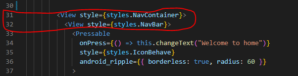
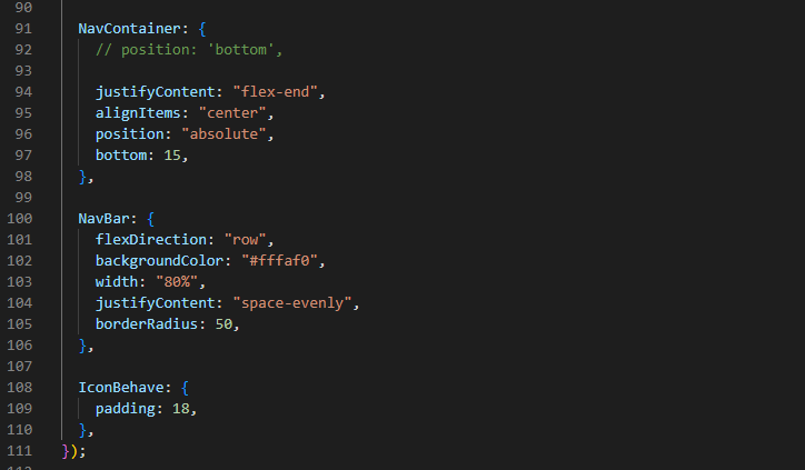
Image 7
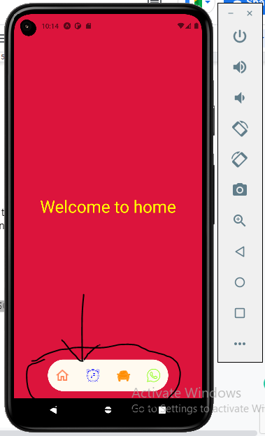
- Add IconBehave for setting the behavior of icons. For this, create a Pressable with a close Tab. The empty pair of parentheses added is basically a lambda function. I have added
<Pressable onPress={() => this.changeText(“Welcome to home”)} style={styles.IconBehave}>
</Pressable>
</View>
In the Pressable, I have added the First icon as “Welcome to home” and provided the style with styles.IconBehave. Also, if you want to change anything with the icon, you can edit the styles.IconBehave.
- Click on save and you will see the Navigation Bar at the bottom of your emulator or running android device.
- As per the used color and size of icons and backgrounds, my app is shown as given in image 8.
- After this navigation bar is created, you have to create different icons in it. Such that as you click on those icons, personalized texts indicating the function of the icons display on the screen.
- In this app, I have created four icons namely home, alarm, car and whatsapp. Refer to image 9.
Step 8: Creating icons in the navigation bar
- To insert the icons into the built project, you have to download your preferred icons from “https://icons8.com/icons” and save it in the ‘asset’ folder of the project.
- You also need to change the text for each icon. Refer to the following code line for importing icons and respective display text.
1
2
3
4
5
6
7
8
9
10
            <Pressable
              onPress={() => this.changeText("Welcome to home")}
              style={styles.IconBehave}
              android_ripple={{ borderless: true, radius: 60 }}
            >
            <Image
            source={require("./assets/Icons/home.png")}
            style={{ width: 30, height: 30, tintColor:'#ff7f50' }}
           />
            </Pressable>
In the above codeline, what I have done is imported the ‘home’ icon with a text showing “Welcome to home”. I have also added a tintColor, definite height and width. Refer to image 10 for the output of this code on the Android emulator.
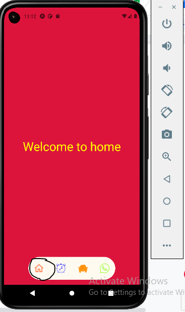
Image 10
- Let’s look at the second icon. Refer to the following codebase.
1
2
3
4
5
6
7
8
9
10
            <Pressable
              onPress={() => this.changeText("It's time to get up")}
              style={styles.IconBehave}
              android_ripple={{ borderless: true, radius: 60 }}
            >
            <Image
            source={require("./assets/Icons/alarm.png")}
            style={{ width: 30, height: 30, tintColor:'#0000ff' }}
          />
            </Pressable>
Here, I have imported ‘alarm’ icon with a screen display text “It’s time to get up”. Refer to image 11 for the emulator output.
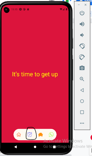
Image 11
For the third ‘car’ icon and the display text “Car settings”, I have used the following code lines.
1
2
3
4
5
6
7
8
9
10
            <Pressable
              onPress={() => this.changeText("Car settings")}
              style={styles.IconBehave}
              android_ripple={{ borderless: true, radius: 60 }}
            >
            <Image
            source={require("./assets/Icons/car.png")}
            style={{ width: 30, height: 30, tintColor:'#ff8c00' }}
          />
</Pressable>- For the last ‘WhatsApp’ icon, I have considered the following code lines. Also, I have customized the display text for this Whatsapp icon as “You have a new message”.
1
2
3
4
5
6
7
8
9
10
            <Pressable
              onPress={() => this.changeText("You have a new message")}
              style={styles.IconBehave}
              android_ripple={{ borderless: true, radius: 60 }}
            >
            <Image
            source={require("./assets/Icons/whatsapp.png")}
            style={{ width: 30, height: 30, tintColor:'#7fff00' }}
          />
            </Pressable>
In this way, you are done with creating all the icons and a complete custom bottom tab navigator.
The most fun fact about the steps of importing icons is that you don’t have to remember all these code lines. You need to simply copy and paste the same codes for the number of icons you want to place in your bottom navigator. Then, you have to change the <Image source>, tintColor,and this.changeText based on your preference. Accordingly, the output will change as you click on different icons of the bottom tab navigator on the emulator. Refer to image 9.
Summary
In an app, the bottom tab navigator is an important part. In this tutorial blog, I have discussed each code line for a better understanding of the users. If you are confused about where to start, you should definitely give read this blog. Trust me! Following these steps, you can customize the app’s bottom tab navigator as per your preference. You can also play around with different icons, colors, and personalized icon-specific texts.

A science graduate who has a keen interest to lean about new technologies and research area. With an experience in the field of data analytics and content writing, she aims to share her knowledge among passionate tech readers.