How do you implement dark mode and light mode in a react native app?
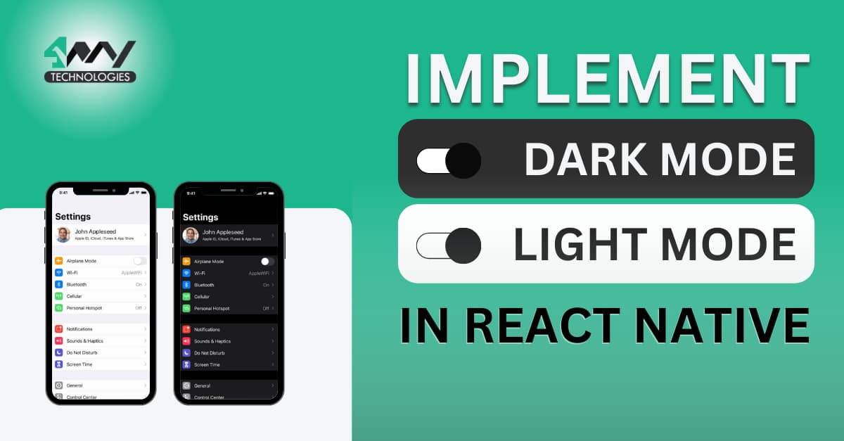
When operating mobile apps at night, you may have switched the display theme into dark mode. Isn’t it? It is necessary to provide a pleasant user experience by making the app easy to read and operate in low and bright light. In this blog, you will learn the steps of implementing Dark Mode and Light Mode and develop app with React Native development company.
This feature is considered a must-have for any app that supports mobile users. Adding any functionality to an app should be done in a minimalist approach. Choosing the JS-based app development framework, i.e., The React Native framework can allow you to meet this criterion. Also, in React Native, there are different ways to integrate dark-mode and light-mode themes. We will focus on a single and the easiest approach.
So, let's begin.
React Native setup configuration
This is the most important step for any developers who are starting with this cross-platform app development framework. However, if you have already built React Native projects, you must be familiar with the significance of this setup process.
My concern is to guide beginners with the process of React Native Environment setup.
For the Environment setup in your system, install Android Studio, NodeJS, and VS Code editor. You can also consider other code editors of your preference. However, the most recommended code editor or IDE is the Visual Code editor. Also, you need to create the paths for the Java and Android SDKs under the Environment Variables segment.
Note that you have to consider the latest version of Android Studio. You can also go for the Marshmallow (Android 6.0 SDK) or newer version.
While installing NodeJS, consider Node Version Manager specifically for Windows.
Check this referenced article for step-by-step guidance.
Here, we are only focused on the Android platform and not on the iOS platform. For the iOS platform, the setup process will vary.
Building a basic template
You need a basic project where you can add the codebase specific to your needs. So, let's learn how we can build this template.
- Create a new folder (maybe in your C drive).
- Open a terminal or command prompt from the folder and run
npx react-native init Light_dark --version 0.68.1. Hit enter. - Thus your template ‘Light_dark’ is created on your C drive.
Here, we have used the 0.68.1 version of React Native.
Now as we are done with the prerequisite setup process, we will move forward with the codebase.
The codebase for the dark and light-mode theme integration
It is a simple Login-based app where the user can switch between dark and light themes.
You don't have to create another file. Open the code editor from your ‘Light_dark’ template and go to the App.js file to start editing the code.
Also, check the entire project in the GitHub repository.
Importing relevant components
1
2
import { StyleSheet, Text, View,useColorScheme,Switch,TextInput } from 'react-native'
import React,{useState} from 'react'
As you can see, the code imports Stylesheet, Text, View, useColorSheme, Switch and Textinput from react-native library.
Also, it imports useState and React from the react library.
Here, useState and useColorScheme are the hooks.
useColorScheme provides colour schemes. Supported color schemes are “dark”, “light” and ”null”. useState hook is used with useColorScheme to update the change in the display theme.
Here, StyleSheet, View, Text, TextInput and Switch are used to create the UI of the app.
Introducing the dark mode
1
2
const App = () => {
  const DarkMode=useColorScheme()=='dark';
This code creates a React component App. It uses a hook useColorScheme to check whether the user has selected dark mode or not. If the user has selected dark mode, the background color of the View component will change to black, or else, it will remain white.
Using the useState for the state variable
const [dark,setDark]=useState(DarkMode)
This code uses the useState hook to create a state variable dark in a React component. The initial value of the variable dark is set to the "DarkMode".
The setDark variable is the second element in this array. It is used as a function to update the value of the "dark" state variable.
Rendering the app View, a Switch and a text element
1
2
3
4
5
6
7
8
9
return (
    <View style={{  flex:1,
      backgroundColor:dark?'black':'white',
      alignItems:'center',
      justifyContent:'center'}}>
      <Switch value={dark} onValueChange={(val)=>setDark(val)}/>

      <View>
<Text style={{color:dark?'#ffffff':'black',fontSize:22,alignSelf:'center'}}>Login</Text>
The code renders a switch and the view.
The switch is used to toggle between dark and light mode.
The flex property of the view is set to 1,the background color of the component is set to either black or white depending on the value of the dark variable. The alignItems and justifyContent properties are set to center.
A switch is added on the screen, clicking which the user can shift from light to dark mode and vice versa. The code is designed in a manner such that the value of the switch is set to the variable "dark" and when the switch is clicked, the function "setDark" is called with the new value of the switch as an argument. Here, onValuechange, an event handler is used to make the call.
The text color is set to either white or black depending on the value of the dark variable. The text displays ‘Login’ on the app screen.
Using TextInput to add placeholder property
1
2
3
4
5
6
 <TextInput placeholder='Email' style={{  width:340,
              height:40,
              borderWidth:1,
              borderColor:dark?'#ffffff':'black',
              marginHorizontal:30,
              marginTop:20}} placeholderTextColor={dark?'#ffffff':'#454545'}/>
This code introduces a text input field for an email address. The width of the field is 340, the height is 40, and the border width is 1. The border color is white if the variable dark is true, and black if it is false. There is a margin of 30 on the left and right sides of the field, and a margin of 20 on the top.
The text color of the placeholder ‘Email’ is white if the display mode is dark and if it is white, the placeholder text is colored with the code #454545 (approx Charcoal color).
1
2
3
4
5
6
7
8
9
10
<TextInput placeholder='Password' style={{
              width:340,
              height:40,
              borderWidth:1,
              borderColor:dark?'#ffffff':'black',
              marginHorizontal:30,
              marginTop:20
            }}
            placeholderTextColor={dark?'#ffffff':'#454545'}
            />
This code introduces another text input field for the password.
The styling is the same as that of the first text input field, the only difference in the second text input field is that the placeholder text is ‘Password’.
Exporting the main component
1
2
3
4
5
</View>
    </View>
  )
}
export default App
Here, we have to close the View tag and then export the App. this will enable you to use the codebase embedded in this App.js file to another file within this project.
Creating StyleSheet object
1
2
3
4
5
6
7
8
9
10
11
const styles = StyleSheet.create({
  loginText:{
    color:'#000000',
    fontSize:22,
    alignSelf:'center',
    marginTop:20
  },TextInput:{

  }

})
As you can notice from the code-syntax that it contains two style objects, loginText and TextInput. The loginText style object has four properties: color, fontSize, alignSelf, and marginTop. The TextInput style object is kept empty.
Execute the codebase
After creating the codebase you need to check the accuracy of your program. So, you have to run the program on a device (either emulator or a real device). Let me show you how you can run the program on an emulator.
- Run the Command prompt from your template folder.
- Pass npm install on the cmd.
- Also, pass npx react-native run-android on the same cmd after passing npm install.
This will start the emulator after the bundling process.
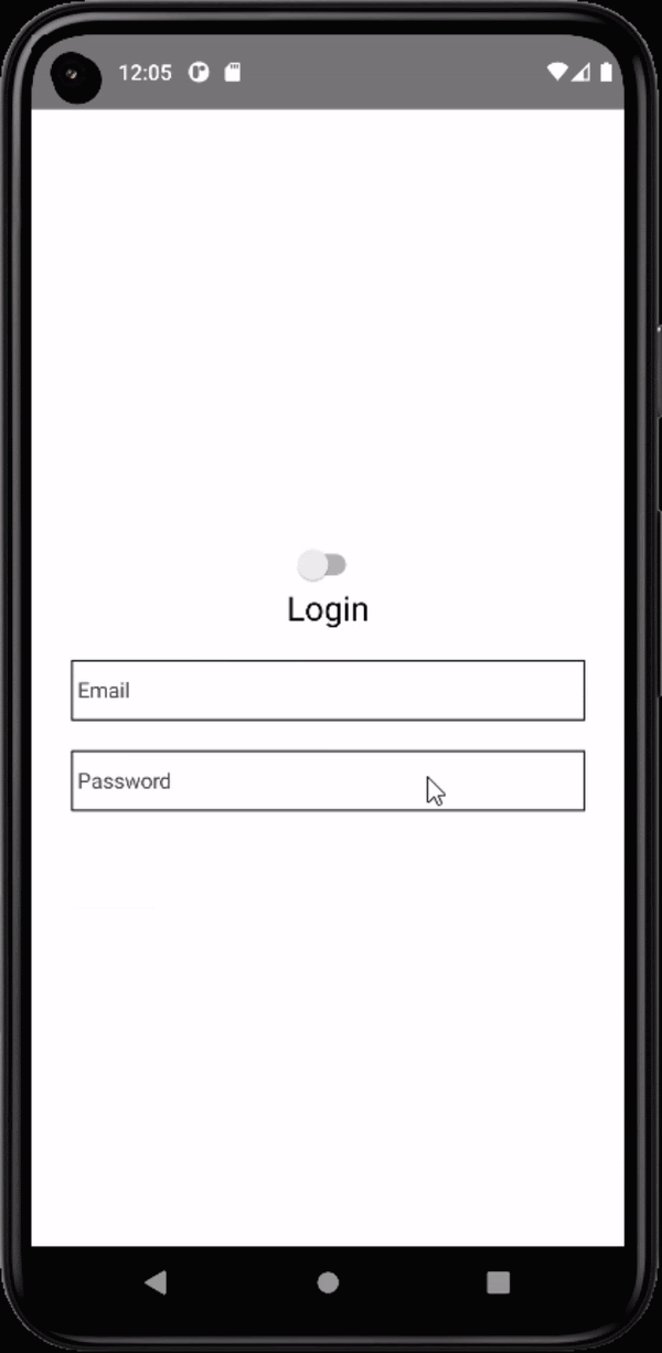
Image 1
Check image 1 for the output. It successfully runs on the emulator. Users can easily toggle between both the light and dark mode by clicking on the switch.
Summary
Creating a dark and light mode display interface is easy. However, you need to create an app in which you can integrate this two-state display mode. Also, we have not used any third-party library for this project. Considering the easiest way, you can use the React Native framework and its native component to build the entire project.

A science graduate who has a keen interest to lean about new technologies and research area. With an experience in the field of data analytics and content writing, she aims to share her knowledge among passionate tech readers.