Build a Drawing Application with React Native
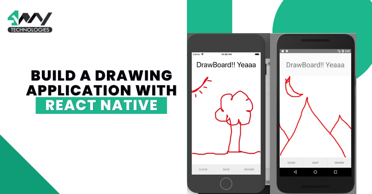
Do you want to explore your art and creativity on the go? Then you should have something called ‘Drawing application’ on your phone. Let’s build a digital canvas using the most popular mobile app development framework preferably used by the react native app development company.
First, we have to perform some prerequisites.
Pre-requisites for the project
Here, you have to complete three simple tasks. Following are those.
The Environment Setup
Think of an instance where you want to build something, and you don’t have the ingredients. Will you be able to complete the task? You can’t. A similar context fits applicable in the current project. Before starting with the main section of the project, you have to install specific software and set the environment.
Here, we will use Expo CLI. It is a tool for building React Native projects. So, install Expo CLI, npm or Node.js, Android Studio, and VS Code editor. Also, get the app Expo Go on your Android mobile device. You can install it from the play store. For detailed assistance, check out the blog on How to Setup the React Native Development Environment.
A Folder for the Project
This folder is needed for every project. You don’t have to perform the environment setup steps every time you build a React native project. It is a one-time process. However, you must build a project folder when working on a new project. This allows you to assign a specific area for every project where you can store the code and assets.
So, you must open a terminal from a local folder and run expo init Drawing.
Note: ‘Drawing’ is the project’s name. You can assign any other name for your project. Simply replace the word you chose as the project’s name in the specified command.
Installing Third-Party Library
To simplify the process, you need some third-party modules supported by the React Native framework. This is the beauty of this framework that you don’t have to work hard but smart. To select the relevant model for any project, you must become familiar with its use.
So, considering the requirements of the current project, you need to install the following libraries.
- Expo-status-bar- This library offers you a compatible interface and component you may require for managing the app status bar. You can easily make any alterations to the status bar.
- React-native-gesture-handler- With the gesture-based API offered by this library, you can add smooth touch interactions in React Native project.
- @shopify/react-native-skia- It is used to add high-quality 2D graphics as shown.

Source: Github.com
When you add this library to your project, you embed the entire Skia Graphics Library.
- React-native-reanimated- React Native Reanimated offers additional tools and features for creating gesture-based interactions. It wraps the general Animated library.
- @expo/vector-icons- This library provides ready-to-use icons for Expo app. You can import Ionicons, FontAwesome, and Material icons.
What to Code?
Doodling is the most fun activity. Isn’t it? Yet, the most exciting task is to code for building the digital canvas. So, let’s get started with the coding section.
Here, we will build a single file called App.tsx file. Check the source code stored in the Github repository.
Get Relevant Components
The first thing that you must do while coding is import relevant components.
1
2
3
4
5
6
7
import { StatusBar } from "expo-status-bar";
import React, {useState } from "react";
import {View, Dimensions, TouchableOpacity, StyleSheet } from "react-native";
import {Gesture, GestureDetector, GestureHandlerRootView} from "react-native-gesture-handler";
import {Canvas, Circle, Path, Skia, ImageSVG} from "@shopify/react-native-skia";
import Animated, {useSharedValue, withTiming, useAnimatedStyle, withSpring} from "react-native-reanimated";
import { Ionicons, FontAwesome5 } from "@expo/vector-icons";
Use the ‘import’ statement and specify the libraries from which you will get the components.
The snippet above shows the components required for this project.
Defining the Interface: IStamp, ICircle and IPath
1
2
3
4
5
6
7
8
9
10
11
12
13
14
15
16
17
18
19
interface IPath {
  segments: String[];
  color?: string;
}

interface ICircle {
  x: number;
  y: number;
}
interface IStamp {
  x: number;
  y: number;
  color: string;
}

enum Tools {
  Pencil,
  Stamp,
}
Besides three interfaces, the code defines an enum.
An interface defines a contract on a function with respect to the arguments and their types.
The interface IPath has two properties: segments, an array of strings, and color, an optional string property. The interface ICircle has two properties: x and y, which are numbers. The interface IStamp has three properties: x, y, and color.
The enum Tools has two values: Pencil and Stamp. Enums define a set of named constants.
Defining States using the ‘useState’ Hook
1
2
3
4
5
6
7
8
9
10
11
12
13
export default function App() {
  const { width, height } = Dimensions.get("window");

  const paletteColors = ["red", "green", "blue", "yellow"];

  const svgStar =
    '<svg class="star-svg" version="1.1" ……………..></polygon></svg>';

  const [activePaletteColorIndex, setActivePaletteColorIndex] = useState(0);
  const [activeTool, setActiveTool] = useState<Tools>(Tools.Pencil);
  const [paths, setPaths] = useState<IPath[]>([]);
  const [circles, setCircles] = useState<ICircle[]>([]);
  const [stamps, setStamps] = useState<IStamp[]>([]);
The code exports a function, 'App'. It uses the 'useState' to define four states: activePaletteColorIndex, activeTool, paths, and stamps. The function also defines two constants: paletteColors, an array of strings, and svgStar, an SVG string. The svgStar is used to draw a star on the screen.
The ‘useState’ also adds two more states: circles and stamps.
The activePaletteColorIndex keeps track of the index of the active color in the paletteColors array.
The activeTool keeps track of the active tool.
The paths, circles, and stamps manage the paths, circles, and stamps respectively drawn on the app interface.
The component renders a canvas element and buttons. The canvas element draws the paths, circles, and stamps on the screen. The buttons are used to change the active tool and color.
Defining a Pan Gesture
1
2
3
4
5
6
7
8
9
10
11
12
13
14
15
16
17
18
19
20
21
22
23
24
25
26
27
28
29
30
const pan = Gesture.Pan()
    .runOnJS(true)
    .onStart((g) => {
      if (activeTool === Tools.Pencil) {
        const newPaths = [...paths];
        newPaths[paths.length] = {
          segments: [],
          color: paletteColors[activePaletteColorIndex],
        };
        newPaths[paths.length].segments.push(`M ${g.x} ${g.y}`);
        setPaths(newPaths);
      }
    })
    .onUpdate((g) => {
      if (activeTool === Tools.Pencil) {
        const index = paths.length - 1;
        const newPaths = [...paths];
        if (newPaths?.[index]?.segments) {
          newPaths[index].segments.push(`L ${g.x} ${g.y}`);
          setPaths(newPaths);
        }
      }
    })
    .onTouchesUp((g) => {
      if (activeTool === Tools.Pencil) {
        const newPaths = [...paths];
        setPaths(newPaths);
      }
    })
    .minDistance(1);
The given code snippet defines a pan gesture. It uses the ‘Pan’ function from the react-native-gesture-handler library.
The defined gesture handles panning on the screen.
The ‘onStart’ function activates when the gesture starts. If the active tool is set as the pencil, a new path is created and added to the 'paths', adding the current color.
The onUpdate function activates when the gesture updates. A new segment is added to the path if the pencil is used as the active tool and a path is assigned in the paths state.
The onTouchesUp function activates when all touches are released.
The minDistance sets the minimum distance required for the gesture to be recognized.
Defining a Tap Gesture
1
2
3
4
5
6
7
8
9
10
11
12
13
14
15
16
17
18
19
20
 const tap = Gesture.Tap()
    .runOnJS(true)
    .onStart((g) => {
      if (activeTool === Tools.Stamp) {
        setStamps([
          ...stamps,
          {
            x: g.x - 25,
            y: g.y - 25,
            color: paletteColors[activePaletteColorIndex],
          },
        ]);
      }
    });

  const clearCanvas = () => {
    setPaths([]);
    setCircles([]);
    setStamps([]);
  };
The code defines a tap gesture using the Tap function. The gesture is used to handle taps performed on the app screen.
The event handler onStart activates at the start of the gesture.
If the stamp is defined as the active tool, a new stamp is integrated and added to the stamps. It has the existing color.
Lastly, the clearCanvas clears all the paths, circles, and stamps from the screen.
Defining Animated Styles with useAnimatedStyle
1
2
3
4
5
6
7
8
9
10
11
12
13
14
15
16
 const paletteVisible = useSharedValue(false);
  const animatedPaletteStyle = useAnimatedStyle(() => {
    return {
      top: withSpring(paletteVisible.value ? -275 : -100),
      height: withTiming(paletteVisible.value ? 200 : 50),
      opacity: withTiming(paletteVisible.value ? 100 : 0, { duration: 100 }),
    };
  });

  const animatedSwatchStyle = useAnimatedStyle(() => {
    return {
      top: withSpring(paletteVisible.value ? -50 : 0),
      height: paletteVisible.value ? 0 : 50,
      opacity: withTiming(paletteVisible.value ? 0 : 100, { duration: 100 }),
    };
  });
This code defines two animated styles using the useAnimatedStyle hook. The first style is animatedPaletteStyle, and the second is animatedSwatchStyle.
The withSpring and withTiming functions animate the top, height, and opacity properties of the animatedPaletteStyle and animatedSwatchStyle, respectively. You can assign both functions directly to a Shared Value or as a value for a style object returned from useAnimatedStyle.
useSharedValue is a hook to create a shared value accessed by multiple components. It is the same as stateful data in a regular React app and stores dynamic data that can be animated in Reanimated. Shared Values share data between the UI thread and the JavaScript thread.
useAnimatedStyle is another hook to create an animated-style object. It is used as a value for a style object.
Handling Taps and Pans on the Screen
1
2
3
4
5
6
7
8
9
10
11
12
13
14
15
16
17
18
19
20
21
22
23
24
return (
    <>
      <GestureHandlerRootView>
        <View style={{ height, width }}>
          <GestureDetector gesture={tap}>
            <GestureDetector gesture={pan}>
              <Canvas style={{ flex: 8 }}>
                {circles.map((c, index) => (
                  <Circle key={index} cx={c.x} cy={c.y} r={10} />
                ))}
                {paths.map((p, index) => (
                  <Path
                    key={index}
                    path={p.segments.join(" ")}
                    strokeWidth={5}
                    style="stroke"
                    color={p.color}
                  />
                ))}
                {stamps.map((s, index) => {
                  const image = Skia.SVG.MakeFromString(
                    svgStar.replace("{{fillColor}}", s.color)
                  );
                  if (!image) return null;
The 'circles' considers an array of objects representing circles. Each object has two properties: x and a y, representing the circle's center.
The 'paths' also use an array of objects representing paths. Each object has a property: 'segments'. It is an array of strings representing the segments of the path.
The ‘color’ property represents the path's color.
The 'stamps' represents an array of objects representing stamps. Each object has a ‘color’ property representing the stamp’s color.
The component uses the ‘map’ function to render circles, paths, and stamps. The circles are rendered using the Circle component from the react-native-svg library. The paths are rendered using the Path component from the same library.
The component finally uses two gesture detectors to handle taps and pans on the screen.
Check the complete code saved in the repository for the buttons, palette visibility, and styling objects. Following this, you must run the project on an emulator. Or you can also run the project on your dev system.
To Run the Program
Open the project folder from your local system and run the terminal from the project. You can also go to the terminal and use the common cd DRAWING to access the project’s directory.
You may need to install relevant dependencies. For this, run npm install on the same terminal. Finally, pass expo start to run the development server.
A metro bundler interface will pop up on your screen in which you must choose the device you want to run your project. You can execute the program on your dev system or your Android device.
Refer to the gif for the project output.
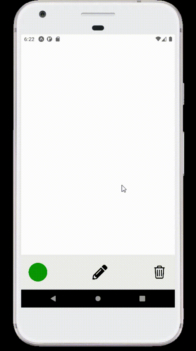
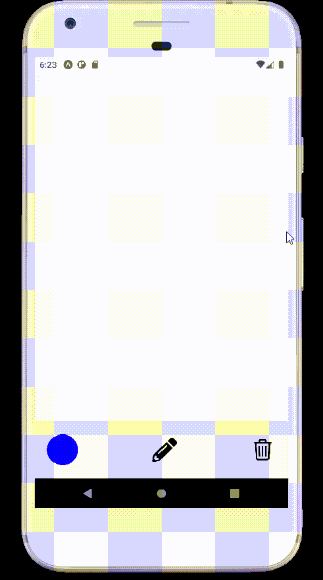
See how the user can draw their imagination on this digital canvas with different colors.
To Conclude
Building a drawing app is one of the interesting projects in your development endeavor. However, it may seem overwhelming in the later phase due to long lines of code. Understand the logic behind the code and start practicing. Also, don’t forget to execute the program once you are done with the coding part. This will help you make changes if needed.

A science graduate who has a keen interest to lean about new technologies and research area. With an experience in the field of data analytics and content writing, she aims to share her knowledge among passionate tech readers.