How to customise React native components

Creating and designing an app does not need long lines of coding. With react native, it is possible to code less and perform better. Despite being a cross platform app development framework, it offers other benefits like the use of native components. Thus if you want to customise components in React Native, you have to be familiar with the basic concepts of React such as props, state, components and JSX. You can also hire react native developers of 4 Way Technologies to assist you in customising core components.
If you want to learn and practise different instances of customising components, this article will help you.
Components in react native
Components are isolated and small segments of code used to compose User Interfaces. They are independent and can be reused. You can use components in a similar way to that of JavaScriptfunctions. When you use a component, you tell the chosen app development framework what you want to see on the pages of your app. With react native, you can immediately show changes in UI designs simply by updating the components and saving the same.
What is meant by custom components? Custom components are the way to define a Core Component and reuse it several times with some changes. This can allow you to use native components and at the same time customise them to maintain the uniqueness of the UI design. Customising components allows you to achieve more flexibility and creativity in terms of front-end designs.
What is the need of using custom components?
In much simpler terms, you need to use custom components to get rid of heavy repetitive codes while designing the UI. It will also allow you to nest them in custom events and other components. The fun fact is that you can pass different props and state components in the Core Component to render the frontend design entirely a new look.
Let’s start discussing two prime components
Types of components
There are two types of components. One is class components and the other one is function components.
Functional components are referred to as Stateless components as they primarily render UI by accepting and displaying data in specific forms. Also, using functional components, you can neither find lifecycle methods nor manage state. On the other hand, class components are called stateful components since they utilise state and logic to render UI.
Here, I have used pets as the component example for both functional and class.
Example code of the functional component
1
2
3
4
5
6
7
8
9
10
import React from 'react';
import { Text } from 'react-native';
const Pet= () => {
return (
<Text>I am your pet!</Text>
);
}
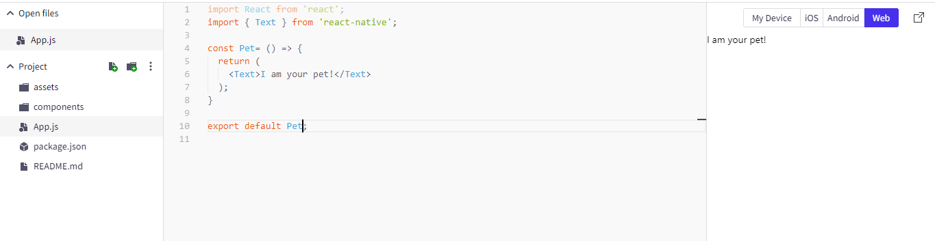
export default Pet;For convenience, we have used the Snack browser to run the code.
On passing the code on the browser, you will see the screen as given below.
Let’s discuss this in detail….
Here, we need to define the Pet component. For this, we write import React from 'react';and import the Text component from react native. Now, with the command const Pet= () => {}; start the chosen component (here, Pet) as a function.
Always note that the function component renders a React element. In the above example, the Pet renders an <Text> element.
What is a react element? A react element allows you to show what you want to show on the screen. For example, the rendered <Text> elements have allowed us to show I am your pet! on the chosen browser.
Finally, I export the Function Pet component using the export default of Javascript. Exporting a component allows its use throughout the built app. This step also lets you import the file contents to other projects.
If you are aware of other options for exporting your component, you are free to opt for them. I used this method of exporting my stated components because it is compatible with the Snack browser. You can go through the article for a better understanding of Javascript export and import.
Example code of a class component
1
2
3
4
5
6
7
8
9
10
11
12
import React, { Component } from 'react';
import { Text } from 'react-native';

class Pet extends Component {
 render() {
  return (
   <Text>I am your pet!</Text>
  );
 }
}

export default Pet;
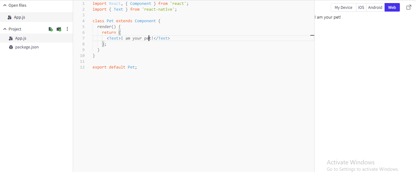
After running the above code line, the following output will be shown on the Snack browser. Although the output is the same, we have used a Class component here. Code lines with class components are wordier compared to the functional component.
Let’s get a detailed explanation of the code lines…
- Using the command
import React, { Component } from 'react';I have imported Component from React. - Next, the component (here Pet) starts as the class extending Component:
class Cat extends Component {}
- Class component uses render() function to return a React element. It is shown as the following command
1
2
3
4
5
class Pet extends Component {
 render() {
  return <Text>I am your pet!</Text>;
 }
}- The final code line will be similar to the approach used in the functional component. you have to export the chosen class
Petcomponent withexport default.
Which are better: class components or functional components in React Native?
In terms of performance, functional components are better than class components. However, different users have distinct preferences depending on their usability and knowledge. If you are someone who prefers a shorter way, you would want to use the functional components. However, if you are the one who loves to play with render() functions, you will surely use class components.
Further with functional components, you don’t have to deal with complicated syntax and can also get access to prop destructuring. Thus it allows you to understand the output of used components more readily.
Here, I will use functional components in all the following examples for customising react-native components.
Core components: React Native
Before we start customising react native components, it won’t be fair enough to skip the concept of reusable and nestable Core Components of react native. These core components lie at the centre of react native custom components.
Although there are numerous Core Components, we will be focusing on <Text>, <View> and <TextInput> components.
- <TextInput>
It is a basic component that allows you to input text in the built applications. These components use props to render configurability for different features like auto-capitalization, auto-correction, placeholder text and numeric keypad. One of the functions that you can operate with text input is to validate messages or texts while the user is typing.
- <Text>
It is a core react component which is used to display text. Text supports touch handling, styling and nesting.
Nesting text is commonly used for displaying modified text. The operation behind displaying formatted text is through annotating string ranges with unique styles such as coloured and bold. You can use the following command:
1
2
3
4
5
6
7
8
const styles = StyleSheet.create({
 baseText: {
  fontWeight: 'bold'
 },
 innerText: {
  color: 'blue'
 }
});- <View>
Another important core component is used to create and style UI. In simpler terms <View> component is a container that allows you to use accessibility, touch handling, style and flexbox controls. For better clarity, the <View> component is accompanied by StyleSheet. For example, you can specify the flex direction, padding and height of a box you want to colour.
Custom components
Now that you have become familiar with the core components, let’s start with customising React native components with Text, View and TextInput.
1
2
3
4
5
6
7
8
9
10
11
12
13
14
15
16
17
18
19
20
import React from 'react';
import { Text, TextInput, View } from 'react-native';

const Pet = () => {
 return (
  <View>
   <Text>Hello, I am...</Text>
   <TextInput
    style={{
     height: 80,
     borderColor: 'red',
     borderWidth: 8
    }}
    defaultValue="My name is.."
   />
  </View>
 );
}

export default Pet;
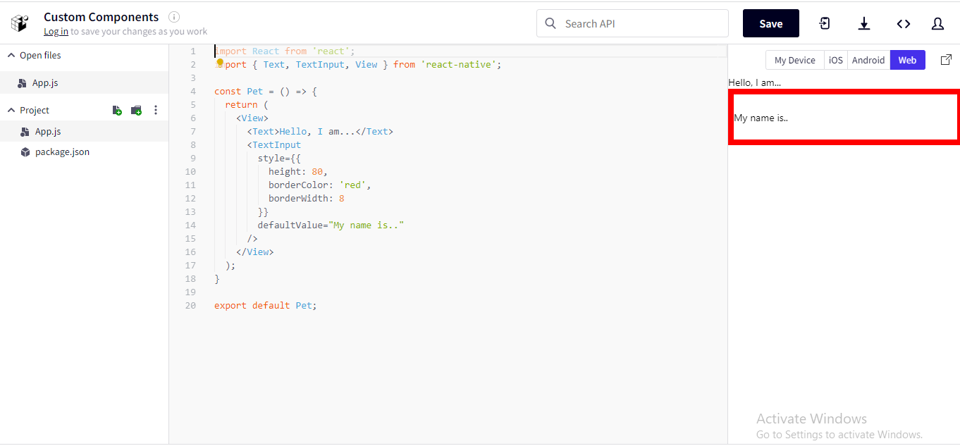
If you are looking for a quick overview of the above code lines, here it is:
- We have used functional components to design the UI of the app.
- For custom components, we have imported three core components Text, TextInput and View from React Native.
- To design the box, place editable text and display default text, we have used
<Text>and<TextInput>under<View>. <Text>displays the uneditable messageHello, I am...and<TextInput>is used to style the editable text and the box.
In the Snack browser, the output will be shown below.
Also, you can make this component visible several times in different places of the applications without any repetition of the code lines. You only need to use the <Pet> component
Let’s see an example.
1
2
3
4
5
6
7
8
9
10
11
12
13
14
15
16
17
18
19
20
21
22
23
import React from 'react';
import { Text, View } from 'react-native';

const Pet= () => {
 return (
  <View>
   <Text>I am the favourite pet of my owner.</Text>
  </View>
 );
}

const House= () => {
 return (
  <View>
   <Text>Bienvenue!</Text>
   <Pet/>
   <Pet/>
   <Pet/>
  </View>
 );
}

export default House;
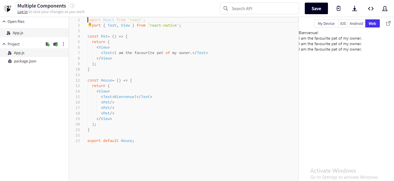
Here, in the above code line, Bienvenue can be stated as the parent component and the individual Pet is referred to as the child component. The reason behind referring to Bienvenue as the parent component is that it renders other Pet components.
There is no restriction on the quantity of including pets in your house. You can put as many as you like. However, an individual <Pet> will render a specific value, which can be easily customised with props.
Props
In customising react native components, the concept of ‘props’ play a significant role. Here, Props means properties. Without props, you can only play with the core components. However, with definite Props, you can render a unique style and format to the Core components.
Let’s see a practical example for a better understanding.
First Example: Rendering name and category to each pet
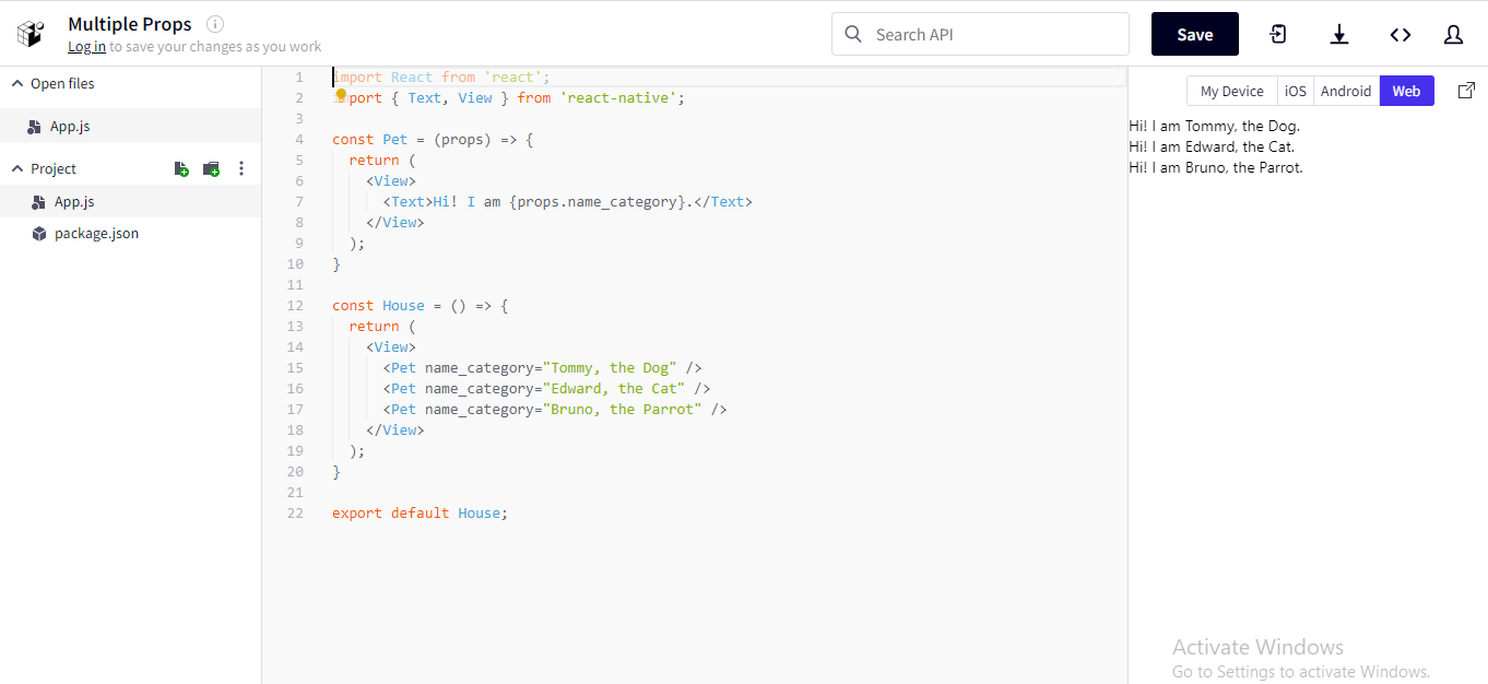
I will run the following code in the Snack browser to render each <Pet> a unique name_category for Pet to render.
1
2
3
4
5
6
7
8
9
10
11
12
13
14
15
16
17
18
19
20
21
22
import React from 'react';
import { Text, View } from 'react-native';

const Pet = (props) => {
  return (
    <View>
      <Text>Hi! I am {props.name_category}.</Text>
    </View>
  );
}

const House = () => {
  return (
    <View>
      <Pet name_category="Tommy, the Dog" />
      <Pet name_category="Edward, the Cat" />
      <Pet name_category="Bruno, the Parrot" />
    </View>
  );
}

export default House;
After running the code, you will come across the following output, where each pet will introduce its name along with its category.
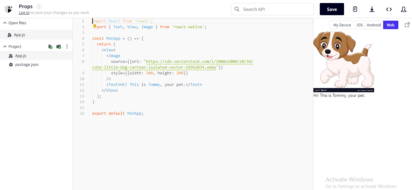
Second Example: Customising image
Here, we will show how you can use a prop source to display a unique image using the Core Component Image.
For this, run the following code in the snack browser. You can customise the Image component by changing the source of the image. You can also play with the height and width of the image.
1
2
3
4
5
6
7
8
9
10
11
12
13
14
15
16
import React from 'react';
import { Text, View, Image } from 'react-native';

const PetApp = () => {
  return (
    <View>
      <Image
        source={{uri: "https://cdn.vectorstock.com/i/1000x1000/20/34/cute-little-dog-cartoon-isolated-vector-22962034.webp"}}
        style={{width: 200, height: 200}}
      />
      <Text>Hi! This is Tommy, your pet.</Text>
    </View>
  );
}

export default PetApp;
On passing the code, you will be shown the below-given output.
Now you have the freedom to manipulate relevant props and display your favourite pet on your app. Isn’t it amazing!!!
Assuming that you have become familiar with the use of Core Components and props, let's step forward with the concept of State.
What is the State of React component? The state is the personal data storage of a component. Unlike props, the state is used for data management. Using state, you can provide definite memory to the component. If the provided data changes, the component starts re-rendering.
Let’s get a detailed understanding of how State works in customising react native components.
State
The state is for building interactive components.
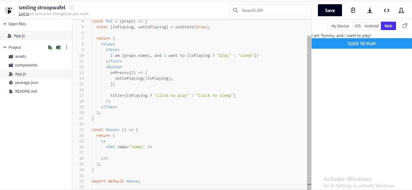
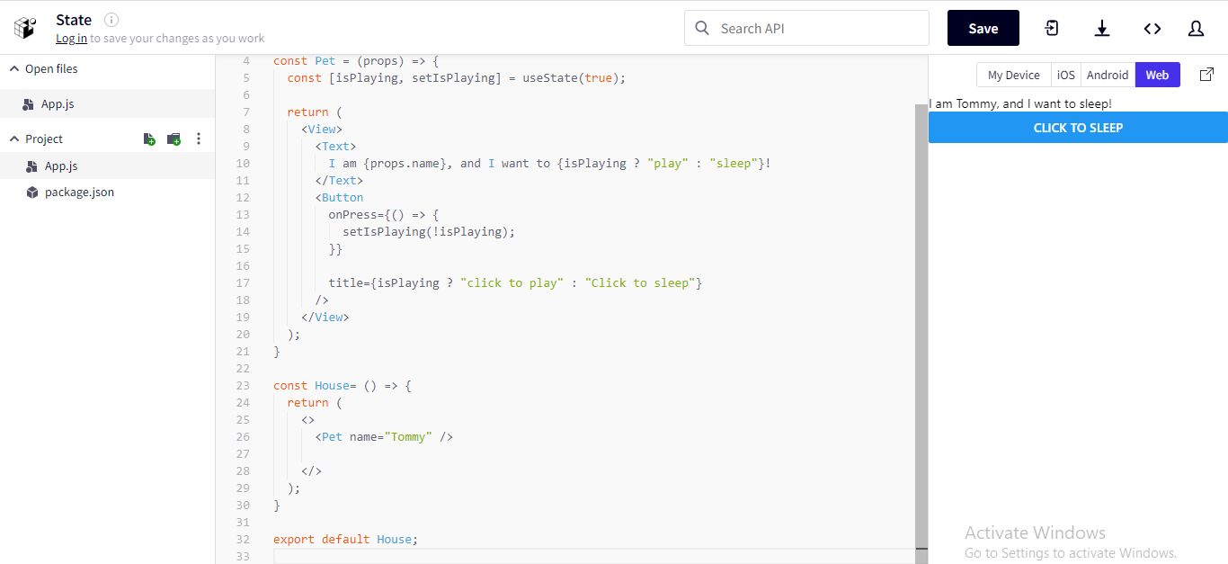
Let’s practise using States for customising react native components. Here, we have used State to store the timely activities (here, only playing and sleeping) of the pet dog, Tommy. We have created a button, which on clicking changes to the other activities.
For this run the following code in the Snack browser.
1
2
3
4
5
6
7
8
9
10
11
12
13
14
15
16
17
18
19
20
21
22
23
24
25
26
27
28
29
30
31
32
import React, { useState } from "react";
import { Button, Text, View } from "react-native";

const Pet = (props) => {
  const [isPlaying, setIsPlaying] = useState(true);

  return (
    <View>
      <Text>
        I am {props.name}, and I want to {isPlaying ? "play" : "sleep"}!
      </Text>
      <Button
        onPress={() => {
          setIsPlaying(!isPlaying);
        }}

        title={isPlaying ? "click to play" : "Click to sleep"}
      />
    </View>
  );
}

const House= () => {
  return (
    <>
      <Pet name="Tommy" />

    </>
  );
}

export default House;
Detailed understanding of the code lines:
- We have imported
useStateHook from React using the command:import React, { useState } from 'react'; - We defined the state of the component by passing
useStatein the function. In the current code line,useStateis used to define the state variableisPlaying.
1
2
3
4
const Pet = (props) => {
  const [isPlaying, setIsPlaying] = useState(true);
  // ...
};- Now, we use a vital Core Component of
Buttonwhich can allow us to press a button option to change the activity preference of Tommy. Here, we have also passed anonPressprop. On pressing the button on the screen,onPresswill be fired which changes thetitle.
The operation is shown as the following command.
1
2
3
4
5
6
7
 <Button
        onPress={() => {
          setIsPlaying(false);
        }}
        disabled={!isPlaying}
        title={isPlaying ? ""click to play" : "Click to sleep"}
/>- Lastly, we have passed the
Petin theHousecomponent.
On Pressing the button, you will get the below-given snips as the alternative outputs.
Final words: Customisation with the right approach
Customisation has become the ultimate preference of users. So why should the app-making process lag behind the benefits of customisation? With react native, you can render a custom look to the Core components as per your preference. Now you can get rid of the boring native Core components. With Props, State and Core Components, you can build a completely different and creative UI design to interact with your users.

A science graduate who has a keen interest to lean about new technologies and research area. With an experience in the field of data analytics and content writing, she aims to share her knowledge among passionate tech readers.